INTERIORS
Surrey’s Premier Lifestyle Magazine
Desire for design
Interior design is an art form that stretches the creative juices to the full. We all have our favourite themes and periods, but whatever décor we choose there’s always some seasonality to bring into the home. Joanna Johns offers some tips for the coming winter months.
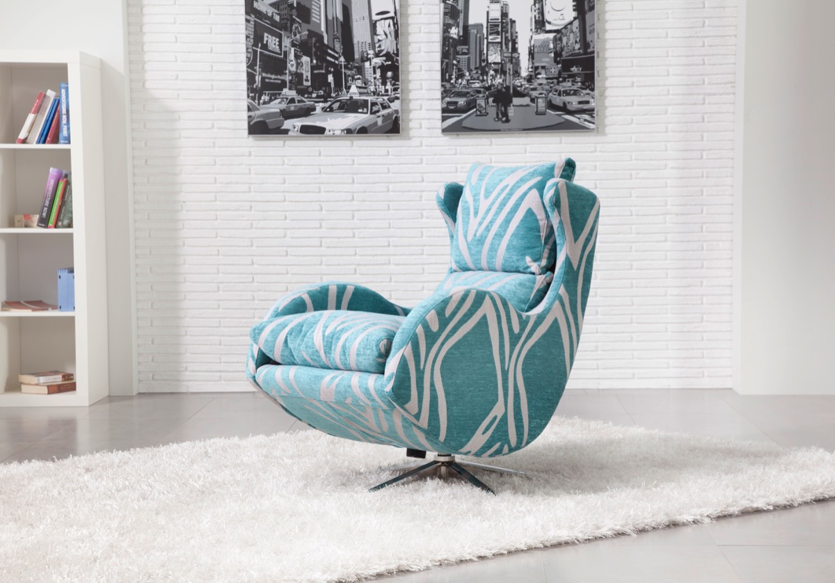
Enzo chair
The throw away culture is disappearing as people seek original, heritage and quality items. There’s an abundance of handmade and crafted goods with provenance to be found at, amongst other venues, large fairs such as the recent Big Arts show in Milford (www.thebigartshow). These items span art, textiles and printed fabrics, ceramics, glass and mixed media. It’s all about those unique finds that can add a special touch.
Autumn doesn’t necessarily entail a lack of greenery and flowers, it’s about how you style it. There are many beautiful faux arrangements available (see article on transforming your home page14 www.focalpointdesigns.co.uk). Faux is a great way to go and is guaranteed to last the season. Gleen inspiration from classic old Dutch Master’s paintings of tulips, peonies, hydrangeas and asters set against inky backgrounds.
The Global fusion style is steadily gaining ground on the interiors scene (see the Halsted Design feature in the essence October issue). A mixture of tribal prints and African inspired handmade goods oozing pattern, texture and bohemian rustic beauty. These are perfect for autumn and encompass everything from rugs, cushions and blankets to wall hangings, lampshades and ceramics. These add instant warmth, depth and interest to any interior.
Dark saturated colours can be embraced to create a cosy and sophisticated look for these colder days. Rich earthy shades, deep olives, smooth chocolate browns, murky blues, and charcoal greys. Contrast these with hits of saffron yellow, spicy reds and orange to make a room special.
With lighting add a shimmer with soft-brushed gold and brass fittings. The polished look is waning, so search for tarnished antiquated finishes or oxidized metals and match with warmer copper. If sparkle excites, then look for oversized chandeliers and play around with scale for some added drama.
Using mixed materials that contrast is increasingly popular in home accessories. Opposites attract so raw concrete set against delicate brushed golds, aged woods against matt finish marble and soft smooth leathers interwoven with rough hessian twine.
With temperatures on the way down, autumn is perfect to start bringing in knitted mohair blankets, tufty longhaired sheepskins and patterned cushions. This will echo the increasing popular Danish philosophy of Hygge (the art of enjoying life’s simple pleasures), and create a calm contentment when snuggling up in front of the fire.
Website: www.darlingsofchelsea.co.uk
Autumn doesn’t necessarily entail a lack of greenery and flowers, it’s about how you style it. There are many beautiful faux arrangements available (see article on transforming your home page14 www.focalpointdesigns.co.uk). Faux is a great way to go and is guaranteed to last the season. Gleen inspiration from classic old Dutch Master’s paintings of tulips, peonies, hydrangeas and asters set against inky backgrounds.
The Global fusion style is steadily gaining ground on the interiors scene (see the Halsted Design feature in the essence October issue). A mixture of tribal prints and African inspired handmade goods oozing pattern, texture and bohemian rustic beauty. These are perfect for autumn and encompass everything from rugs, cushions and blankets to wall hangings, lampshades and ceramics. These add instant warmth, depth and interest to any interior.
Dark saturated colours can be embraced to create a cosy and sophisticated look for these colder days. Rich earthy shades, deep olives, smooth chocolate browns, murky blues, and charcoal greys. Contrast these with hits of saffron yellow, spicy reds and orange to make a room special.
With lighting add a shimmer with soft-brushed gold and brass fittings. The polished look is waning, so search for tarnished antiquated finishes or oxidized metals and match with warmer copper. If sparkle excites, then look for oversized chandeliers and play around with scale for some added drama.
Using mixed materials that contrast is increasingly popular in home accessories. Opposites attract so raw concrete set against delicate brushed golds, aged woods against matt finish marble and soft smooth leathers interwoven with rough hessian twine.
With temperatures on the way down, autumn is perfect to start bringing in knitted mohair blankets, tufty longhaired sheepskins and patterned cushions. This will echo the increasing popular Danish philosophy of Hygge (the art of enjoying life’s simple pleasures), and create a calm contentment when snuggling up in front of the fire.
essence info
Darlings of ChelseaWebsite: www.darlingsofchelsea.co.uk
Foreign assignment
Thomas Coombes Interior Design aims to produce timeless homes bespoke and practical to each client. Our team has expertise in textiles, interior architecture and design, advertising and colour, allowing us to offer a range of skills for any situation.
We in and around Surrey, but as many of our clients have properties abroad we do design abroad. One such was for a client’s properties in Grimond, South of France.
The owners of Villa Bastide are clients we have worked with for many years so have a good understanding of their requirements. For this project the brief was to create a tranquil space whilst being sympathetic to the age and style of the property. They required a relaxed French country feel integrated with some modern pieces to create a more contemporary look.
Naturally the distance was a challenge as just popping around the corner to do site visits or checking an aspect of the design wasn’t an option. Keeping the style of the existing property and its surroundings, obviously different to more local projects offered different challenges.
The lighting was based on creating a relaxed ambience to compliment the Villa’s beautiful and serene surroundings. We incorporated many styles of lamps in varying shapes and sizes with finishes such as glass and antique silver to provide a rustic yet contemporary look. It was important to the client the lighting created romance and warmth, linking the hues and tones of the interior with the nature around.
With the fabrics the clients specified a neutral palate and natural fabrics to remain sympathetic property. Stunning linens for upholstery and the curtaining, keeping the interior light and airy with the main focus to combine the natural outdoor space with the interior of to make this a stunning property.
We achieved the desired look with luxurious silks and velvets in rich sumptuous tones for window dressings and upholstery alongside faux fur throws and rugs for a more welcoming feel.
Case study - Thomas Coombes
Prior to moving to this property our clients were living in a much smaller house in the area and made the decision not to bring any of their existing furniture with them enabling us to start from scratch. An exciting prospect but it was vital that we got every detail right so that the finished result was stunning. The owners wanted a home that was practical for their family and lifestyle whilst giving an aura of glamour and luxury.
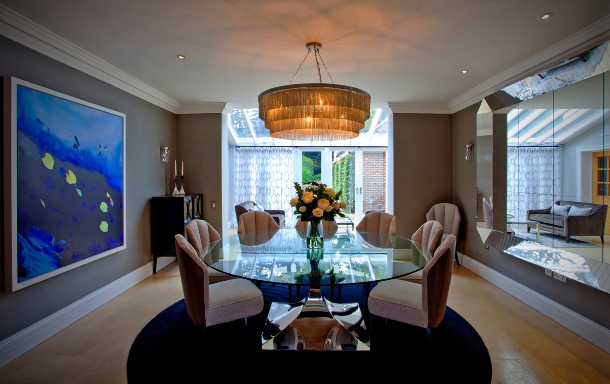
The first phase of the project was the downstairs of the house where the oak staircase is a very imposing feature. It was important to our clients that the staircase was no longer the focal point of the hallway and to detract from it we commissioned a beautiful bespoke three tiered, chain chandelier from Tigermoth lighting which created a stunning centrepiece. The colourway of the walls and carpet were also changed to compliment the oak rather than clash with it.
We mirrored the chandelier in the dining room with a smaller version which we hung over a beautiful Tom Faulkner dining table. Porada mirrors in the hallway and dining room added opulence and gave an extra wow factor.
Another challenge was the living room which, a very large space with multiple windows overlooking the beautiful gardens. The clients did not wish for this space to be too formal as they wanted to feel they could use it on a daily basis. This was a particular challenge to deliver an elegant look that also gave the feeling of a cosy family area. We achieved the desired look with luxurious silks and velvets in rich sumptuous tones for window dressings and upholstery alongside faux fur throws and rugs for a more welcoming feel. Beautiful accessories and coffee table books were added to give the room a more ‘lived in’ feel, and stunning table and floor lamps set the mood. The final item added to the room was a baby grand piano which finished the room off perfectly.
Our clients were delighted with the scheme and we are now designing a new kitchen for them to finish off this beautiful family home.
essence info
Website: www.thomascoombesdesign.comTelephone: 01372 464735
Email: info@thomascoombesdesign.com
Hunter White Design
Interiors of quality and individualityHunter White design offers interior design and interior architecture services to homeowners, developers and commercial clients in the south of England. Working on a wide range of properties, from new, luxury developments to historic listed buildings, they create custom-designed interiors of the highest quality.
Inspired design
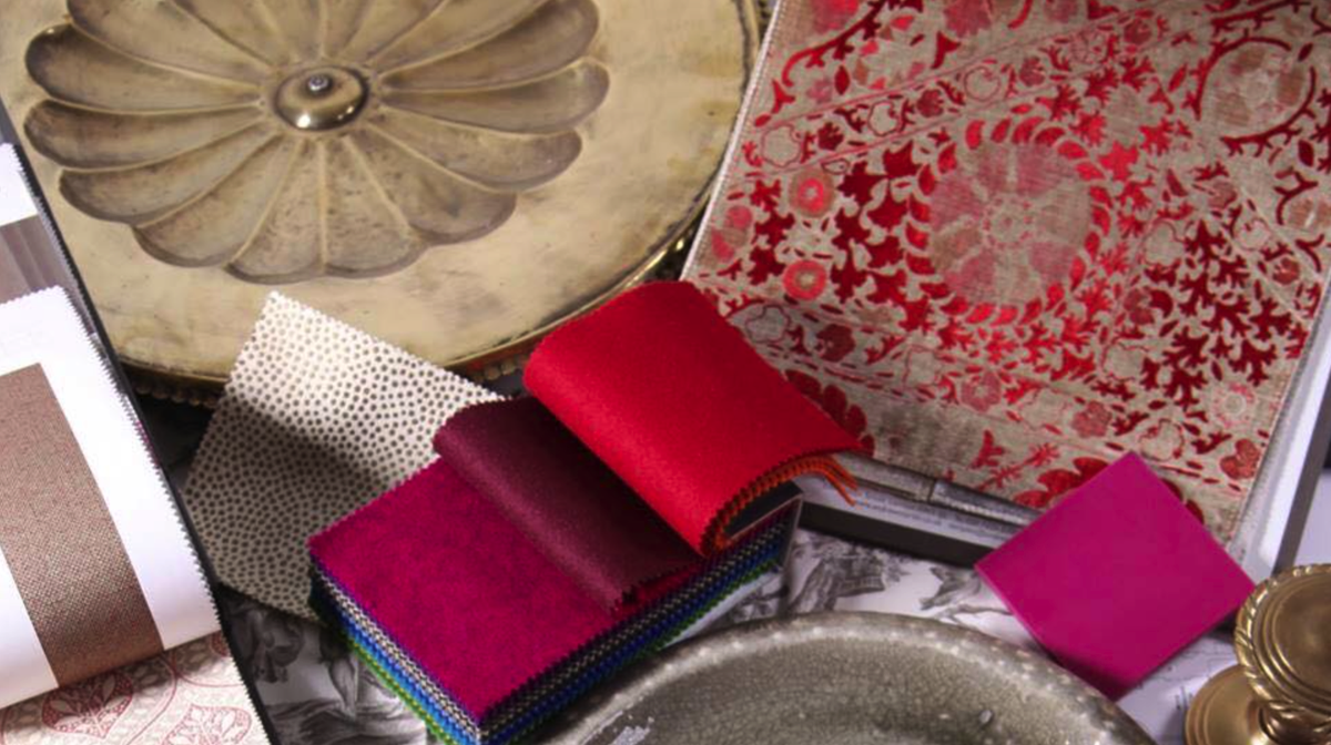
The concept of style in interior design is as much about how a room feels as how it looks. Colours, textures, light and shade, furnishing and accessories should all harmonise, not just for visual effect, but also to enhance the quality of lifestyle offered by an individual property.
Hunter White Design, whether working with developers or directly with homeowners, take time to understand clients’ aspirations before applying their experience and creativity to capture them.
Perfect functionality
Space is the most valuable asset in a property, so clients are encouraged to invest in making the most of what is available. Individual spaces should flow effortlessly from one to another, each contributing its distinct character within the whole concept. As professional interior architects, Hunter White Design are able to realise the full potential of any layout, whether by restructuring, reorganising room uses and circulation routes, or simply by creating a unified decorative scheme.
Understated elegance
Every commission is individual, but the basic principle at Hunter White Design is to create interiors of quiet luxury, with impeccable specifications. Aiming to achieve elegance without compromising on comfort or character is the goal. Colour and lighting are deployed strategically to create the perfect atmosphere. Furnishings, accessories, or artworks are used to reflect personal choice, but should also complement the scheme and be beautiful and interesting in their own right.
essence info
For an informal discussion about what Hunter White Design could do for you call 01730 893193.Website: www.hunterwhitedesign.co.uk
Email: studio@hunterwhitedesign.co.uk
Interior inspiration
Ruth Marshall of Ruth Marshall Interiors offers her take on the hottest trends for 2017.September is my favourite month in the interiors calendar. It’s the month that sees two great trade shows for interior designers – Maison et Objet in Paris and Decorex in London. Interior designers come away feeling inspired to specify some of the latest and greatest for their clients. The shows are the perfect opportunity to identify upcoming trends.
True colours
Greys, grey-blues and nature-inspired colours all continue to flourish this autumn. Blue captures the mood of the moment – it’s the colour of life – a versatile colour that can be combined with delicate pastels for a crisp and airy feel, or alternatively used with darker colours to create a more dramatic and moody ambience. Multinational decorative paint company Akzo Nobel’s Colour of the Year 2017 was recently named as ‘Denim Drift’ – a timeless and versatile grey-blue that takes on a different characteristic depending on the light, colour combination, and situation. Akzo’s colour trend predictions are always spot-on, and this year is no exception.
Another stand-out colour trend for the coming season is the use of deep emerald and sage greens. These colours look stunning on upholstery when combined with tan leathers and brass lighting in an otherwise neutral room, but can take on a far more opulent role when combined with dark woods and other jewel colours such as deep purple or royal blue.
Top textures, perfect patterns
Natural textures will feature large in 2017. Materials such as wood, smooth terracottas and stunning geometric encaustic tiles continue to be popular flooring choices. It’s also great to see cork making a comeback, but don’t worry, it’s far more exciting than the flat cork tiles of old, and you could consider an entire wall of cork in a playroom or open plan living space. It’s great for absorbing sound and creates an interesting feature wall for you to pin whatever takes your fancy.
Layering your fabrics and accessories is the key to cosying – use heavy weave linens on upholstery and layer up with cosy wool knit throws, adding cushions in lush velvets, raw silks and faux fur to generate luxury and warmth. If you like a calm, neutral scheme, then mixing the fabric textures will add interest and make your room so much more inviting. If you prefer more colour then why not introduce some bold indigo blue or bright coral into your scheme. These colours will look great combined with a co-ordinating (or clashing) floral print or graphic geometric design from the more colourful autumn collections.
Windows of opportunity
Windows are reassuringly uncomplicated – the place for swags and tails is at tall windows where the architectural style of the property dictates an elaborate window treatment. Simple, smart tailored curtains add a more timeless appeal to a room, and hand finished deep double pinch pleat curtains hung on a pole look great in most rooms, with single pleat or ‘wave’ curtain headings providing a crisp, no fuss look in a more contemporary space. Roman blinds are also a great choice for contemporary interiors, and there’s no need for inconvenient, ugly cleat hooks and cords anymore as blinds are now fitted with child-safe breakaway connectors that will ‘break’ at a weight of 6kg.
There’s a limitless choice of designer curtain poles, ranging from traditionally crafted wood with elaborately carved finials through to funky poles in bright neon colours for the young-at-heart, with clear acrylic poles at the other end of the scale for those of you who don’t want their curtain poles to play a starring role.
Back to the wall
The beauty of walls painted in a timeless chalky heritage colour will never fade, but for people looking for something a little more daring there is a vast range of digitally printed large format wallpapers and panels that are an artwork in themselves. The beauty of digital printing is that you can have just about anything printed to fit the wall in question, but there are also plenty of large-scale papers and panels out there that could also fit the bill. I love these floral panels from Sanderson’s stunning new Waterperry Collection – perfect in a sunny garden room – a true celebration of the gardens of England that taps into the current trend for large botanical motifs.
Bold as brass
One very noticeable shift at the interiors shows was a move towards warmer metals, with antiqued brass, bronze, and dark steel dominating many of the new lighting and furniture collections. These metal finishes are much softer than the polished chrome and brushed steel of late, and work wonderfully well with the current blue-greys and greens. Shown is one of my favourite lights – Andromeda – a Mid Century inspired antiqued brass ceiling light with adjustable arms and swivel head fittings that would work in most design schemes.
Pleated perfection
Geometric, origami-style ceramic accessories abound – with matt finishes in neutral colours – a look that works so well with other natural textures. Succulents look amazing in these pots, particularly when coupled with a lovely brass or gold bowl to add some contrasting colour and feel. Kelly Hoppen is the master of ‘East meets West’ design, and has a wide range of accessories in this style.
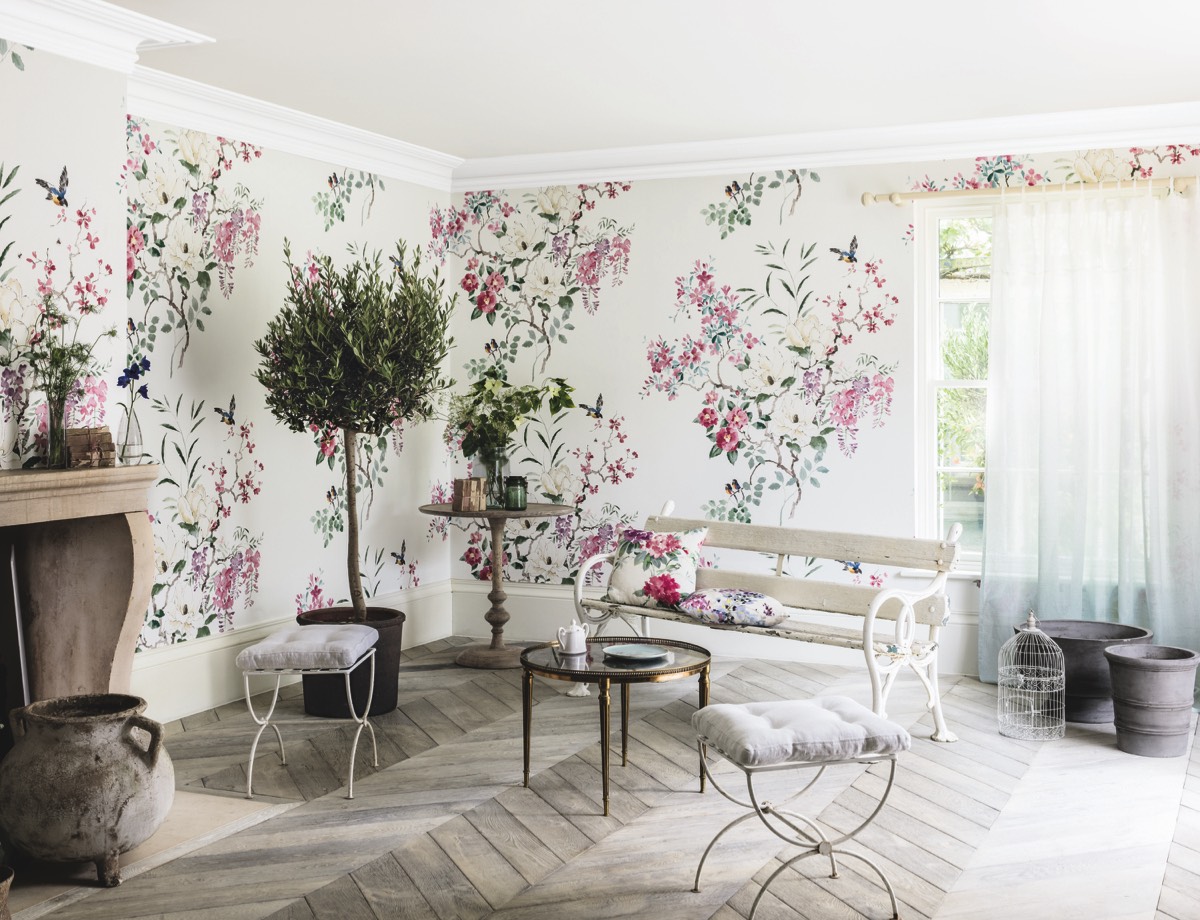
Sanderson Magnolia & Blossom wallpaper
essence info
Website: www.ruthmarshallinteriors.comTelephone: 0203 590 6728
Email: studio@ruthmarshallinteriors.com
