April 2016
Translating art into cushions
08/04/16 11:41 Filed in: Interiors
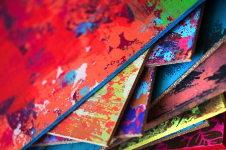
Fashion editor turned home accessory designer Susi Bellamy has a host of inspirational experiences to draw on. From working with legendary photographer David Bailey to living in Florence for six years, this former Condé Nast employee has brought art to the sofa in the form of her stunning cushion line. Here she chats to Jane Pople about why she left the fashion magazine world to set up her own brand and shares her top three tips on revamping a living space.
Photos copyright: Peter Atkinson
Q You used to work as a fashion editor at Condé Nast publications; how and why did you first get into the fashion industry?
A I studied fashion journalism at the London College of Fashion and when I graduated at 21 I was taken on as a fashion assistant on a London magazine. However, after a couple of shoots on my own, they made me the fashion editor and I never looked back. I had done some work experience when I was at college at Brides Magazine at Condé Nast and a few years later they invited me to interview for the job of fashion editor. It was wonderful working there and a naturally happy environment considering the subject matter. I spent every December in the Caribbean photographing the summer issues and was lucky enough to also work with David Bailey, Norman Parkinson and Lord Snowdon to name a few. Also, we were one of the first magazines to use Kate Moss as a model when she was only 16. Working behind the camera definitely helped me as an artist in the future with a view to composition and colour. It has informed my work ever since.
Q What led you to leave the fashion world behind to pursue design and setting up your own brand?
A I left the magazine world after my first child, Jack, was born and my husband was posted to the States for his work. This secondment didn’t include a green card for me, so I took up painting as a hobby. I never stopped painting and after years of practice as an artist I eventually completed an MA in fine art in 2013, which led to me having my own studio in Newcastle. It was only 11 months ago that I set up my own brand when I decided my artwork could translate well into cushions.
Q Can you tell us about your time living in Florence? Would you say that has inspired your designs today?
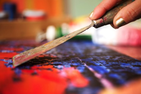
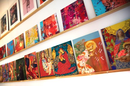
A Living in Florence for almost seven years was like a dream come true. I was not only inspired by the history of the city, but also by the fashion and the Italian innate sense of colour. When I created my Madonna series of collages, inspired by the street corner shrines, I worked closely with an artisan framer whose ability with carving and gilding had been handed down for generations. Living and working in such an environment was a daily inspiration and has informed all my work since. The crumbling plaster of the palazzo walls and the beautiful countryside also inspired my abstract work which I create using a plasterer’s trowel to give a textured and layered effect.
Q Why did you decide to create a line of cushions, and can you tell us about the design process from initial concept to finished product?
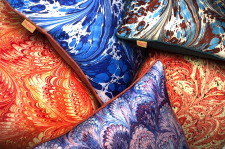
A I had created some large paintings on wood in my studio and I think it was my background working on magazines that led me to edit and crop them. So I took the large painting downstairs to the woodwork studio and asked them to cut it up into eight equal squares. I placed this work on a shelving system I have in my studio and studied them for a while. It then became apparent to me that they could possibly work well as cushion designs and the rest is history. I carried on working on some of the crops and left others – I then photographed them and had them digitally printed using dye-sublimation printing (this high quality process harnesses the rich texture of the artwork onto a silky flat surface) by a British printer in Nottingham. I found this the best sort of printing to harness the colour. I also work from marbled paper I had produced in Florence to create a second range of cushions which I felt worked well with the abstracts. All the cushions are piped, which gives a frame-like effect to the printed artwork, and the backing fabric is chosen carefully to complement the colour palette. This led me to describe them as ‘art for the sofa’. I enjoy the transition from 2D to 3D.
Q All of your cushions are made in England. Is that something that is important to you?
A It is very important to me that my product remains very British. Quality is of the utmost and I didn’t want to compromise that by printing abroad where I had no control over the process. I also feel proud to be showing my work with integrity and supporting our economy.

Susi’s top three tips for revamping a living space
Colour – colour can transform a space and be uplifting. There are so many beautiful colours to choose from, but I particularly like the tertiary tones – the ones that are slightly slubby and toned down versions of the primaries.
Interesting and eclectic art and objects – I love to mix old and new, traditional and abstract. It adds a twist to an interior. I particularly like sculptural objects on plinths.
Lighting – a good mixture of lighting adds mood and allows change.
Q Can you tell us about your work with The Colour Group?
A The Colour Group (GB) is a non-profit organisation that promotes colour education and shares information to anyone interested in colour. A lot of the members and committee members are scientists and they approach colour from a completely different angle to me, but I was brought in to help organise events around art and fashion. I have organised art workshops, lectures at the Tate Modern on Malevich and Sonia Delaunay as well as a science event in Newcastle. We meet at City University in London once a month and it has opened my eyes to many aspects of colour and a broad range of interesting people. You could describe us as ‘colour nerds’!
Q What is your most treasured possession and why?
A I have a copy of a Michelangelo bust in gesso that an Italian friend of mine made in Florence. Her father had owned a shop in the historic centre and owned moulds of Renaissance sculpture – the father died and the shop closed down, but every time I look at it I am transported back to Florence and the Bargello (sculpture museum) and the Uffizi. I can even smell the coffee!
Q How would you describe your own home style and what is your favourite room in your house and why?
A I would describe my home style as classic with a twist and full of colour. We live in the main wing of a large house in the Tyne Valley near Hadrian’s Wall, and my favourite room is my kitchen as it has uninterrupted views from a bay window across the valley with not one blot on the landscape and a great view of my neighbour’s beautiful horses. The kitchen was handmade by a local Northumberland craftsman and has lovely high ceilings and original coving. It is also painted in various ‘shades of grey’, but then punctuated by brightly coloured ticking, faux coral sculpture and Tuscan pottery. In the same way as I was keen to have my cushions made in the UK, I also have worked with local craftspeople on my home. We have so much talent here.
Q What has been the hardest part of setting up your own brand and so far what has been the most rewarding part of the experience?
A The hardest part of setting up my own brand has been working to get things right and making mistakes. It is not just the creation of the design and the choosing of the backing fabric, but the whole infrastructure of building a brand and the everyday practicalities such as postage and packing that need to be addressed. The most rewarding part of the experience has been when I have received positive responses to the range and the few times I have been lucky enough to get some lovely press.
Susi’s cushions are filled with an over-stuffed duck feather filling. Beautifully made, they work visually as groups of contrasting designs, or used alone in conjunction with plains for a more classic look. The combination of uniqueness, colour and vibrancy will impact on any interior in the same way as a piece of artwork. Susi has an MA in fine art from Northumbria University which culminated in a degree show at Baltic 39 in 2013. She now works from Cobalt Studios in the Ouseburn, Newcastle. Discover Susi Bellamy’s beautiful range of cushions now available at Amara: www.amara.com.
About Jane Pople
Jane Pople has over five years experience writing about interiors and the design industry favouring emerging designers and new talent. This article first appeared in The Lux Pad, www.amara.com/luxpad.
A house for Essex
08/04/16 11:18 Filed in: Architecture
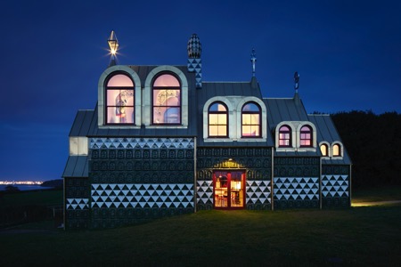
Contemporary artist Grayson Perry’s designer building is a gloriously absurd secular chapel paying homage to the memory of Perry’s fictional Essex woman, Julie May Cope. Unique, slightly unsettling, but certainly moving, it’s a much oversubscribed holiday destination. Emily Bird investigates a phenomena in the small village of Wrabness.
Photos copyright: Jack Hobhouse
Living Architecture’s aim is to shift the perceptions of modern architecture by allowing people to eat, sleep and live in spaces designed by outstanding architectural practices. With many properties dotted throughout the UK, there is a selection of unique buildings to stay in, but no project has been quite as attention grabbing as Grayson Perry’s and FAT Architecture’s A House for Essex which is the architectural embodiment of the noted artist’s daring talent.
Born in Chelmsford, Grayson Perry is one of the UK’s leading contemporary artists and winner of the coveted Turner Prize in 2003. Going on to achieve huge critical and popular acclaim, he specialises in ceramic pots, tapestries and sculptures and has also curated a series of high profile exhibitions around the globe. An icon in popular culture due to his eccentric attire, Grayson Perry is celebrated by art lovers and critics alike and his project for Living Architecture enables fans to immerse themselves in his art.
FAT Architecture has been one of the most challenging and provocative voices in UK architecture during the last two decades and embraces decoration, ornament and explicit communication in its designs, making FAT the perfect pairing for the artist on this project.
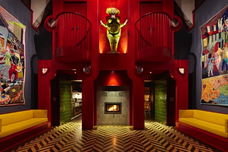
Conceived as a landmark in the tradition of wayside and pilgrimage chapels, A House for Essex is dedicated to a saint of Perry’s creation, Julie May Cope, and gives architectural expression to her life. Described by the artist as an ‘Essex Everywoman’, a working-class woman who went with the default settings of her generation, such as choosing marriage over education, but who had a redemptive second act. Julie’s image is visible throughout the house and the artist’s handmade pots and tapestries depict her colourful life. Looming over it all is the motor scooter that killed her: running over her whilst delivering a curry.
Charles Holland of FAT Architecture describes the space as a radical statement about architecture and its capacity for narrative and communication to tell a rich and complex story.
“The moment I saw it I knew it was perfect. It’s in a little hamlet, the last property in the village of Wrabness, as you walk down a path to the River Stour. It was an old farmhouse: we knocked it down and started again.” Grayson Perry
The house itself is reminiscent of a Russian doll with a series of archetypal house shapes that step up in scale as it descends the hill. Built around a striking decorative object which is part medieval rood screen, part baroque façade, it frames a ceramic statue of Julie Cope. The two bedrooms include walk through cupboards leading to internal balconies overlooking the chapel space below and benefit from views to both the east and west.
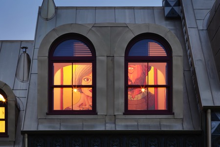
The exterior of the property is the building’s tour de force clad with more than 1,900 green and white ceramic tiles cast from originals made by Perry depicting Julie as a mother and icon, along with symbols associated with her life.
“When Living Architecture offered me the opportunity to collaborate with FAT, it was a golden chance to realise a long held ambition to build a secular chapel. Charles Holland and I batted ideas back and forth until a bonkers yet dignified design emerged glistening. The resulting building is a total artwork, a fiction in which you can live, a digital age shrine and a homage to Charles’ and my home county. I hope the people who stay in A House for Essex find it playful yet monumental, cosy and maybe slightly disturbing. It is a three dimensional musing on religion, local history, feminism, happiness and death.” Grayson Perry
A House for Essex is available to rent on a short-term holiday basis and can sleep up to four people. Due to the extremely high demand for this property, holidays are sold via a ballot open at various points throughout the year offering the chance to purchase a two to three night stay. You can register for newsletter alerts for future ballots via the Living Architecture website.
Websites: www.living-architecture.co.uk and www.fashionarchitecturetaste.com
This article first appeared in The Lux Pad: www.amara.com/luxpad
Profile FAT (Fashion, Architecture, Taste) is an architecture studio with an international reputation for delivering outstanding and award winning projects. Specialising in architecture, cities and design, the company works for cultural, commercial and government clients including Igloo Regeneration, BioRegional/Quintain, Tate, Grosvenor, Selfridges and Rotterdam City Council and is committed to developing client briefs into extraordinary projects.
FAT is directed by three of Britain’s leading architectural and design figures, Sean Griffiths, Charles Holland and Sam Jacob, all committed to developing architectural culture both through practice and design research at institutions including Yale and the Architectural Association. The directors are closely involved in the design of all projects which are managed by a project architect or leader in close contact with the client.
Current projects include the BBC Media Village in Cardiff, The International School, Birmingham, residential schemes in Sheffield and Middlesborough and an art academy in Eindhoven. Recent projects include a library in south east London, a cultural centre and park in Rotterdam and a new build mixed use development in Amersfoort, Netherlands.