Jane Pople
The secret of great interior design
19/04/17 17:16 Filed in: Interiors
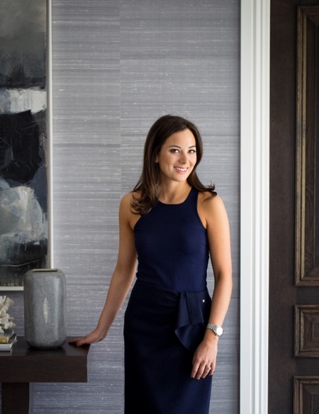
Interior designer Sophie Paterson talks to Jane Pople about the secrets of good interior design and how she overcame career challenges to be where she is today.
Sophie Paterson has an enviable combination of tenacity and business acumen, coupled with wonderful creativity and a natural talent for style. These skills have seen her rise through the ranks to head her own studio, Sophie Paterson Interiors, and become renowned across the industry. Her portfolio boasts many stunning projects that range from a luxury Chelsea apartment to a sprawling urban family home.Q Sophie, what is the secret to interior design?
A I’m not sure it’s a secret, but I think the key is really prioritising the functionality of the space and not just going for something that will look good in a photo. Having lived in various properties I have designed, I’ve learnt on a personal level how important comfort and practicality can be. Small things like having a table in reach of all your chairs so you can put down a drink, having fabrics that don’t give you a nervous tick every time someone sits on them, sofas that feel comfortable to sit on, rugs that disguise stains, wall coverings that resist scratches and marks. I think if you are designing high-end residential projects and you haven’t lived in one of your designed interiors, you could be tempted to prioritise aesthetics over functionality which is never the correct choice. Every client and every home needs to take practicality and comfort into account in order to be truly luxurious. Otherwise you are just living in a show home not a real home.
Q What was the biggest challenge you faced when setting up your own interior design studio?
A There were many challenges ¬– obtaining trade accounts is one hurdle that springs to mind – you need trade account references to set up most trade accounts, so convincing the first fabric house to give a trade account is hard work! I remember being interviewed by Zoffany and Andrew Martin for a trade account, which was daunting at the time. Now I look back and think what was I worried about, but you have to constantly push yourself to grow, so things I used to get phased by don’t even register with me now as a stressful situation. When I look back, I think it’s a blessing that at the tender age of 24 I didn’t fully realise everything that was involved in setting up and running a successful design studio!
Q What is the best advice anyone has ever given you?
A Stop worrying about everything that could go wrong and start thinking about all the things that could go right. In reality, you will find a solution to any problem you come up against. If you think about everything that could go wrong, you’ll end up procrastinating or even failing to try.
Q How would you describe your own home style and what’s your favourite room?
A My home is classic contemporary with a little rustic chic thrown in. My favourite room is either the kitchen or my TV room because they are so relaxing to spend time in. My TV room has layers of gorgeous textures and comfort; my kitchen is such a great space for socialising. I love the views across the garden from all the French doors.
Q If you could design the interior for any space in the world, where would you choose?
A I get asked this question a lot. I don’t have a particularly interesting answer. To me the ideal project isn’t just about the building, it’s about the combination of the building, client, brief and budget. If you get all those things right, then magic happens!
Q What is your favourite type of project to work on and do you have a most memorable project?
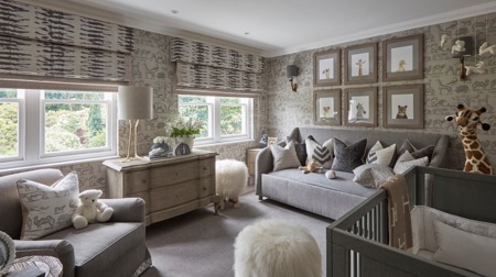
A I like working on complete refurbishments where you get to see a total transformation, and I prefer to work on whole houses or apartments rather than just a few rooms, as I always feel the rooms that are left feel even worse after you’ve renovated the others to a high standard. One of my most memorable projects was designing the nursery for our Cobham project after the rest of the house. We had left this room earmarked as a future nursery. Unveiling the room to the clients was such an emotional experience. They were in tears, we were in tears and even our builder was spotted wiping a tear away! It was such a special room and turned out beautifully. Another noteworthy experience was the recent handover of a Knightsbridge apartment project. The client was very trusting and didn’t visit the project once in the year’s renovation. When we handed the turnkey project over even their personal photos were in the photo frames, candles lit and flowers in the vases. The client’s reaction was just so special and to see how much they loved it is why we all do this job.
Q How would you spend your dream day off?
A If I was in London then I’d either go to Scotts, Zuma or Roka for a long lunch with my husband and baby daughter. Food is one of my passions – often I can be eating one meal whilst planning my next! After that I’d check into the spa at the Corinthia for some pampering. The interiors and treatments there are spectacular.
Q Where is your favourite place in the world?
A One place where I really relax and switch off is my in-laws’ home in Ranch Santa Fe in California. The weather, the beautiful location with gorgeous beaches so nearby, the food, the activities (I love tennis, hiking and shopping!) and company is a great combination. I generally don’t like staying in hotels, so this is one of my favourite places to go to switch off.
Q What are your top three tips for interiors in 2017?
A Embrace metal finishes such as bronze and antique brass. Not only are they more fashionable than chrome, but this is a trend that has longevity – it’s a classic look so won’t look dated in five years.
Colour wise, I love burgundy red, as well as warm tones such as almond and rust on a neutral base.
Q What would you be doing if you weren’t an interior designer?
A Good question. I really don’t know! I love organising things and I’d also need something creative.
Q What does the future hold for Sophie Paterson Interiors?
A We are completing some very large projects this year: a multi-unit project in Marylebone comprising a townhouse, an apartment and all the communal spaces within a high end development, a 13,000 square foot new build house in Chelmsford, an apartment in Marbella, a Grade II listed apartment in Knightsbridge, an apartment in Mayfair and a Grade II listed apartment in Belgravia. We are also expanding our team to allow for the large new projects we have lined up for later this year, so exciting times.
Website: www.amara.com and www.sophiepatersoninteriors.com
This article first appeared in The Lux Pad, www.amara.com/luxpad
Penthouse in the Pavilion
13/05/16 17:09 Filed in: Property
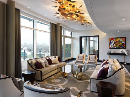
Leading design house Morpheus London is renowned for creating exceptional properties in the world’s most desirable locations, one of which is The Penthouse at the Pavilion development in St John’s Wood. They shared their thoughts on this, one of their favourite projects, with Jane Pople.
Photos copyright: Peter Atkinson
With over 20 years’ experience in the luxury sector, Morpheus’ passion for design excellence and attention to detail has delivered pretty incredible results. The company has designed some of the most luxurious properties in the world, including projects in Singapore, Courchevel and Monte Carlo. This particular project in St John’s Wood had its own challenges, as they all do.
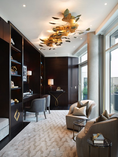
No set brief meant the owner was happy to follow Morpheus’ lead, trusting them to deliver a luxurious feel without over embellishment or feeling over the top. The preference was for rich, sumptuous materials, including leathers and silks, but with a desire for a bright overall look. Thoughtful layout and a stipulation for a dedicated study and ample storage options were a necessity. Given these criteria, the company was able to design bespoke furniture and joinery items, but above all it was essential the stunning views were maintained and enhanced for the cricket-loving owner.
Creation/planning process
Morpheus worked through detailed design stages with the client before progressing through full project management. In addition to the design, this included co-ordination with structural engineers, mechanical and electrical engineers, dealing with building management, all landlord agreements and building control.
This was a perfect project for the team as the client gave absolute trust; so much so that the client’s wife didn’t actually see the property until the day before handover.
Favourite room/part of the project
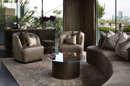
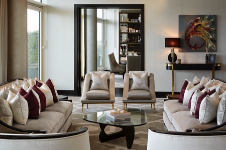
The views from this apartment are wonderful. Morpheus’ favourite part was travelling up to the penthouse in the lift, turning to enter the main reception and being greeted by an expanse of light flooding the room with a huge vista across the famous cricket ground. As the client loved cricket, changes were incorporated to improve layout and dramatically enhance these views. The views over Lords Cricket Ground are completely uninterrupted and can be seen from the penthouse’s 25 metre terrace, as well as from the main reception room, dining area and study.
The penthouse is fortunate to have its own private, tranquil garden to the rear of the property, with panoramic views of the London skyline, and is a peaceful haven amidst the bustle of the city.
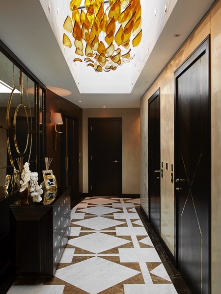
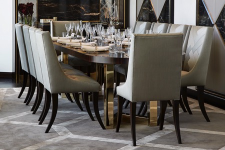
As on all of its projects, Morpheus designed beautiful items of furniture and joinery, including the Thomas James’ entrance hallway console and the Thomas James’ dining table, some of the stand out items of furniture in the apartment. Design details include the fine brass inlay detailing within the fitted joinery and door details. These details incorporate a common thread carried throughout the apartment.
A favourite room is the master bathroom. The rear wall of the bathroom is overlaid in book match marble with the vanity unit, complete with double basins, bespoke designed in a soft, fluid, concave style. Wall mounted taps add to the sleek and minimal look, whilst the large shower area has the showerhead recessed into the ceiling. Lighting throughout the bathroom is subtle and warm, in particular with the back lit mirror and cove lighting over the bath area which causes warm light to wash downwards over the marble.
Project challenges
There were mechanical issues and having to upgrade or introduce new technology into the penthouse, such as audiovisual systems.
The logistics of transporting all of the joinery and certain items of furniture up into the penthouse were interesting at times. The design had to be considered to ensure everything could be installed and fitted. Whilst the penthouse has its own private lift access, it was not large enough to accommodate the sofas, and so each of these had to be carried up eleven flights of stairs!
Penthouse Apartment, The Pavilion, St Johns Wood, London
Floor area: 3,600 square feet
Project time taken: ten months
Websites: www.morpheuslondon.com and www.amara.com.
About Jane Pople
Jane Pople has over five years experience writing about interiors and the design industry, favouring emerging designers and new talent. This article first appeared in The Lux Pad, www.amara.com/luxpad.
Translating art into cushions
08/04/16 11:41 Filed in: Interiors

Fashion editor turned home accessory designer Susi Bellamy has a host of inspirational experiences to draw on. From working with legendary photographer David Bailey to living in Florence for six years, this former Condé Nast employee has brought art to the sofa in the form of her stunning cushion line. Here she chats to Jane Pople about why she left the fashion magazine world to set up her own brand and shares her top three tips on revamping a living space.
Photos copyright: Peter Atkinson
Q You used to work as a fashion editor at Condé Nast publications; how and why did you first get into the fashion industry?
A I studied fashion journalism at the London College of Fashion and when I graduated at 21 I was taken on as a fashion assistant on a London magazine. However, after a couple of shoots on my own, they made me the fashion editor and I never looked back. I had done some work experience when I was at college at Brides Magazine at Condé Nast and a few years later they invited me to interview for the job of fashion editor. It was wonderful working there and a naturally happy environment considering the subject matter. I spent every December in the Caribbean photographing the summer issues and was lucky enough to also work with David Bailey, Norman Parkinson and Lord Snowdon to name a few. Also, we were one of the first magazines to use Kate Moss as a model when she was only 16. Working behind the camera definitely helped me as an artist in the future with a view to composition and colour. It has informed my work ever since.
Q What led you to leave the fashion world behind to pursue design and setting up your own brand?
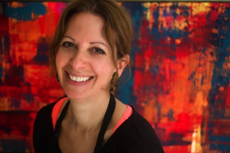
A I left the magazine world after my first child, Jack, was born and my husband was posted to the States for his work. This secondment didn’t include a green card for me, so I took up painting as a hobby. I never stopped painting and after years of practice as an artist I eventually completed an MA in fine art in 2013, which led to me having my own studio in Newcastle. It was only 11 months ago that I set up my own brand when I decided my artwork could translate well into cushions.
Q Can you tell us about your time living in Florence? Would you say that has inspired your designs today?
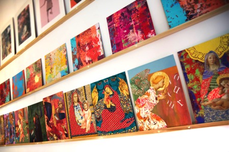
A Living in Florence for almost seven years was like a dream come true. I was not only inspired by the history of the city, but also by the fashion and the Italian innate sense of colour. When I created my Madonna series of collages, inspired by the street corner shrines, I worked closely with an artisan framer whose ability with carving and gilding had been handed down for generations. Living and working in such an environment was a daily inspiration and has informed all my work since. The crumbling plaster of the palazzo walls and the beautiful countryside also inspired my abstract work which I create using a plasterer’s trowel to give a textured and layered effect.

Q Why did you decide to create a line of cushions, and can you tell us about the design process from initial concept to finished product?
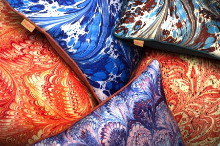
A I had created some large paintings on wood in my studio and I think it was my background working on magazines that led me to edit and crop them. So I took the large painting downstairs to the woodwork studio and asked them to cut it up into eight equal squares. I placed this work on a shelving system I have in my studio and studied them for a while. It then became apparent to me that they could possibly work well as cushion designs and the rest is history. I carried on working on some of the crops and left others – I then photographed them and had them digitally printed using dye-sublimation printing (this high quality process harnesses the rich texture of the artwork onto a silky flat surface) by a British printer in Nottingham. I found this the best sort of printing to harness the colour. I also work from marbled paper I had produced in Florence to create a second range of cushions which I felt worked well with the abstracts. All the cushions are piped, which gives a frame-like effect to the printed artwork, and the backing fabric is chosen carefully to complement the colour palette. This led me to describe them as ‘art for the sofa’. I enjoy the transition from 2D to 3D.
Q All of your cushions are made in England. Is that something that is important to you?
A It is very important to me that my product remains very British. Quality is of the utmost and I didn’t want to compromise that by printing abroad where I had no control over the process. I also feel proud to be showing my work with integrity and supporting our economy.
Susi’s top three tips for revamping a living space
Colour – colour can transform a space and be uplifting. There are so many beautiful colours to choose from, but I particularly like the tertiary tones – the ones that are slightly slubby and toned down versions of the primaries.
Interesting and eclectic art and objects – I love to mix old and new, traditional and abstract. It adds a twist to an interior. I particularly like sculptural objects on plinths.
Lighting – a good mixture of lighting adds mood and allows change.
Q Can you tell us about your work with The Colour Group?
A The Colour Group (GB) is a non-profit organisation that promotes colour education and shares information to anyone interested in colour. A lot of the members and committee members are scientists and they approach colour from a completely different angle to me, but I was brought in to help organise events around art and fashion. I have organised art workshops, lectures at the Tate Modern on Malevich and Sonia Delaunay as well as a science event in Newcastle. We meet at City University in London once a month and it has opened my eyes to many aspects of colour and a broad range of interesting people. You could describe us as ‘colour nerds’!
Q What is your most treasured possession and why?
A I have a copy of a Michelangelo bust in gesso that an Italian friend of mine made in Florence. Her father had owned a shop in the historic centre and owned moulds of Renaissance sculpture – the father died and the shop closed down, but every time I look at it I am transported back to Florence and the Bargello (sculpture museum) and the Uffizi. I can even smell the coffee!
Q How would you describe your own home style and what is your favourite room in your house and why?
A I would describe my home style as classic with a twist and full of colour. We live in the main wing of a large house in the Tyne Valley near Hadrian’s Wall, and my favourite room is my kitchen as it has uninterrupted views from a bay window across the valley with not one blot on the landscape and a great view of my neighbour’s beautiful horses. The kitchen was handmade by a local Northumberland craftsman and has lovely high ceilings and original coving. It is also painted in various ‘shades of grey’, but then punctuated by brightly coloured ticking, faux coral sculpture and Tuscan pottery. In the same way as I was keen to have my cushions made in the UK, I also have worked with local craftspeople on my home. We have so much talent here.
Q What has been the hardest part of setting up your own brand and so far what has been the most rewarding part of the experience?
A The hardest part of setting up my own brand has been working to get things right and making mistakes. It is not just the creation of the design and the choosing of the backing fabric, but the whole infrastructure of building a brand and the everyday practicalities such as postage and packing that need to be addressed. The most rewarding part of the experience has been when I have received positive responses to the range and the few times I have been lucky enough to get some lovely press.
Susi’s cushions are filled with an over-stuffed duck feather filling. Beautifully made, they work visually as groups of contrasting designs, or used alone in conjunction with plains for a more classic look. The combination of uniqueness, colour and vibrancy will impact on any interior in the same way as a piece of artwork. Susi has an MA in fine art from Northumbria University which culminated in a degree show at Baltic 39 in 2013. She now works from Cobalt Studios in the Ouseburn, Newcastle. Discover Susi Bellamy’s beautiful range of cushions now available at Amara: www.amara.com.
About Jane Pople
Jane Pople has over five years experience writing about interiors and the design industry favouring emerging designers and new talent. This article first appeared in The Lux Pad, www.amara.com/luxpad.