Interiors
Out of Africa
28/02/18 02:02
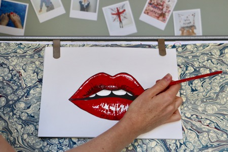
Ali Mapletoft is changing the way we view sustainable fashion. With a background in filmmaking, it was a love of luxury goods that steered this natural creative away from the film industry and into the world of ethical design. Ali founded Age of Reason, a luxury fashion and home accessories brand, filling a gap in the market for high-end designs that have a message and purpose. Aimee Connolly caught up with Ali to find out more.
Q Ali, have you always wanted to be a designer and how did you get started in the industry?A I was a short film director when I started the brand, but I think it was my upbringing in the Kingdom of Lesotho in Southern Africa that really gave me a fever for design. My parents are artists who owned a pottery and gallery and I grew up in remote mountains around craftswomen: weavers, potters, basket makers and painters. Our house was full of hand-woven tapestries, rugs and beautiful African pots. I love high quality materials like natural wool and silk: there’s nothing quite like creating something beautiful out of incredible materials.
Q Were there any challenges in starting your business?
A In some ways ignorance was bliss. As a filmmaker I had a network, so starting from scratch was daunting and lonely at times. It’s a challenge building a brand that people recognise for quality, integrity and meaningful design. There aren’t any shortcuts; I just keep making my pieces as well as they can be, and I gather up talented people on the way to join my team.
Q What is the story behind the name Age of Reason?
A Playing around with names when starting out was great fun – I wanted a name that was timeless but conveyed a strong message. I chose the name after the Age of Enlightenment because I believe that beautiful, luxurious fashion and interior pieces can be made in a sustainable, empowering way. We manufacture in the UK with a small team using the best materials we can find. Our production line is fairly paid, independent and largely female.
Q Age of Reason is changing how people view sustainable fashion and homeware. What first motivated you to create a brand that focused on ethical and sustainable design?
A I love buying things with a story, and if the workforce is empowered and thriving I want to know about it. Working in Soho can be dangerous – I’ve done a lot of shopping in London department stores! I noticed a gap six years ago when I found it amazing how very few sales assistants could tell me how or where something was made. I found it genuinely baffling in a luxury environment and it put me off buying on a number of occasions. I wanted to create a brand that sang integrity.
Q What’s a typical working day look like for you?
A I try to start my day with coffee, reflecting on how I want my day to go. It’s like meditation with caffeine, which suits me just fine. My husband gets the children ready, which really helps.
I head to the studio at about 9am, after breakfast. I never start the day with emails: they come later in the day after I’ve done at least one exciting, creative thing. If I’m drawing, I enjoy listening to singer-songwriters like Patti Smith, or my Mum’s old favourite, Joan Armatrading. I’m a sucker for Nina Simone too. She made an incredible contribution to music. I tell my daughters what her achievements meant then and now as a woman of colour. Women and their histories inspire me – there’s always a moodboard on the wall featuring inspiring women: Florence Welch, Susie Cave, Munroe Bergdorf and Adwoa Aboah are all up there. I’ll always step out to get lunch because I love to walk. Afternoons are for meetings and plotting new paths.
Q What would a tour of your home reveal about you?
A You’d learn that I love accents of popping colour and texture. I’m not about clutter – I’d rather have a few standout pieces and keep the rest chic and pared back. I love a statement chair with a shaped cushion on it and developed a passion for Street Art from time in London, so paintings by Pure Evil and Eine adorn the walls. I need books in my life, so great shelving is a must and you’d learn that someone in the house played guitar!
Q What three home comforts couldn’t you live without?
A It doesn’t matter how busy I am, I always take a bath and read a bit at night. I love a luxurious candle to accompany this little ritual – I have a Bella Freud ‘Ginsberg is God’ candle on the go at the moment. I love good tea and coffee, great bedding and more books.
Q If you weren’t a designer, what would you be?
A I’d probably be a filmmaker or writer. As long as I’m creating something that has impact, I’m happy. I need joyful adventure, freedom and powerful creation. I think being any kind of artist would give me that.
Q What’s the best advice you ever received?
A A friend reminded me: “You can do anything, but you can’t do everything.” I have a great team of people supporting me. I don’t pretend to do this alone.
Q What does 2018 hold for Age of Reason?
A I’m extremely excited about growing into the brand I’ve always dreamt of. The home interiors range will grow and I’ll be adding more wall art to my collections. There will also be a top secret collaboration with an organisation that champions women – watch this space!
essence info
Website: www.age-of-reason-studios.com
Website: www.amara.com
This article first appeared in The Lux Pad, www.amara.com/luxpad
Colour in the home
30/01/18 22:26
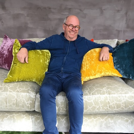
William Yeoward is one of England’s most renowned designers. Known for his sophisticated, elegant and highly individual style, he has designed beautiful products for the home since he opened his first store in Chelsea in 1985. Following the release of his sixth book, Blue & White and other stories, Aimee Connolly sat down with William to talk about his early career and his love of colour in the home.
Q William, before opening your first store in 1985, you worked at Designers Guild. How did this experience help you launch your own brand?A It is always fascinating to see the success of growing a brand, as was happening with Designers Guild when I was working at the company. I learnt to enjoy creative energy, which I hope I always encourage at William Yeoward. My job is to find out what a person has a talent for and then develop it.
Q Do you think your background as an interior designer prepared you for product design?
A I feel that to understand what is required in product design one needs to have gone out looking for it. If, as was so often the case with my decorating work, if I could not find what I wanted, then I would make it myself. It was this that encouraged me to create my own products for the home and I have done so ever since.
Q As a designer of products that are made to last, what do you think of this throwaway culture where interior items are so frequently replaced?
A I think it is such a shame that customers don’t look in more detail at what they are buying. I like to think that when buying a William Yeoward product our clients appreciate the detail in both the design and execution that make them treasure their purchases. Our planet cannot possibly sustain the quick disposable society that we seem to have become.
Q You’ve recently published a book, Blue & White and other stories. Can you tell us about it?
A My sixth book, Blue & White and other stories, is a much more intimate reflection on my recent work. The book is a mix of professional photography and a more personal ‘instagram’ approach that to me captures images in a very immediate way and provides a visual understanding of the inspirational journeys that I go on as I travel the world. These journeys do have a vital influence on my work and this book engages with this creative thought process.
Q The book focuses on your passion for colour in the home. What three tips can you offer homeowners uncertain of using colour in their own home?
A Don’t ask too many friends if ‘you’ve got it right’. If it feels good to you – use it. If it is wrong, then it can always be changed! It wasn’t there until you put it there! Have confidence and know yourself.
Q What is the last item of luxury you bought yourself?
A A fountain pen! I had surgery recently and I was so impressed by the fact that my surgeon wrote with a fountain pen.
Q What is your favourite room in your home and why?
A My library. I read. I love log fires and I enjoy closing the shutters and losing myself in a private world surrounded by all of my favourite pictures, books and music.
Q If we were to take a tour of your home, what would we learn about you?
A I do a lot of shopping and I have a lot of glasses and plates!
Q What does 2018 hold for the William Yeoward brand? Do you have any exciting projects you can tell us about?
A 2018 is always going to be the time to show off our new thoughts and concepts. As I write, I have half an eye on our edit for Christmas 2018. Always look forwards, never back.
essence info
Website: www.williamyeoward.com
Website: www.amara.com
This article first appeared in The Lux Pad, www.amara.com/luxpad
All photos copyright William Yeoward
Style and inspiration
04/12/17 11:15
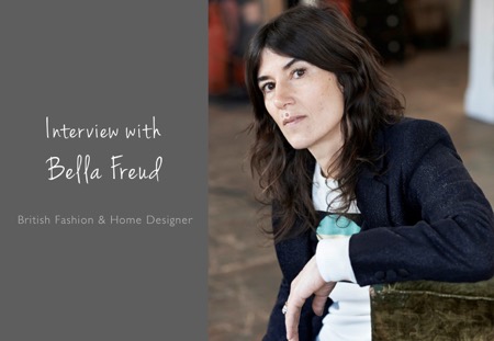
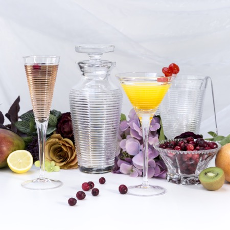
With an enviable artistic lineage – Bella Freud is the grandchild of Sigmund Freud and her father was artist Lucian Freud – it’s no surprise her creativity is boundless, spanning fashion to filmmaking and most recently home design with the launch of a lifestyle collection. Here Bella talks to Jane Pople about her inspirations, being a female entrepreneur and her penchant for rich minimalism.
Bella Freud’s fashion designs have been a stalwart of British cool for over a decade, with her iconic jumpers adored by the likes of Kate Moss and Alexa Chung, her signature style epitomises effortless chic. Launching her own label in 1990, she won Most Innovative Designer at the London Fashion Awards just a year later.Q Bella, what first inspired you to create a home accessories line and is it something you have always wanted to do?
A I think my interest in home wear began with my obsession with sheets. My grandmother ran a small country hotel during the summer months in Co Cork, Eire and she allowed me, aged eight, to help her prepare the rooms, and crucially showed me how to do hospital corners on the beds. In my teens I stayed at the grand house of a friend of my father’s and became entranced by the exquisite nature of the pale blue linen sheets in these much grander bedrooms. That’s where it all started.
Q Do you think fashion for the home is becoming more important to the consumer and how do you see the industry changing over the next decade?
A I think this area is a huge area for growth and creativity. People are really interested in expressing themselves through the style in their homes, not just clothing. I see fashion brands automatically including home accessories into fashion collections rather than waiting to launch as a separate medium. What needs to evolve is the buying approach so that lines aren’t so segregated: it’s good to see things as a story rather than just themes.
Q An interest in film is evident throughout your career, from your producing of short films to collaborating with John Malkovich. What is it that draws you to film as a medium and do you have further plans to work in the field again?
A I find I can access and suggest my ideas using film, I can tell the story better. I have a short film idea that I’m working on now and I’m hoping to shoot it soon.
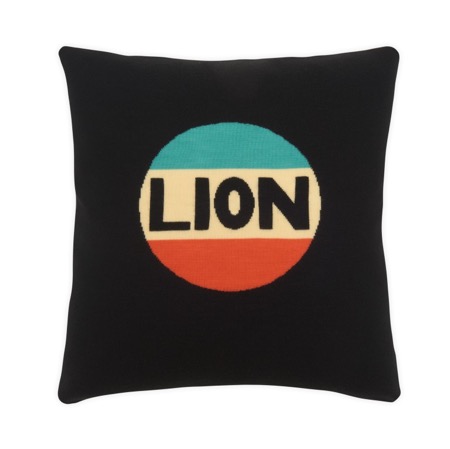
Q As a leading British fashion designer and female entrepreneur, what advice would you give to young women looking to follow in your footsteps? Do you think it’s still harder for women to make their mark in the industry?
A The business of fashion is hard generally, but it seems particularly difficult for women to protect their interests. Most of the people in power financially are men and being ‘tough’ as a woman is not respected the way it is with men. It is generally admired as a strength when a man is adamant and demanding, yet when a woman is the same it is met with resistance and often distaste.
Q What is your favourite part of the working week and do you have a particular product you like to work on most, e.g. fragrance or fashion?
A I particularly like designing the match boxes, I love making the design work in a square shape. It is so simple yet it looks strong and immediate. I enjoy trying to bring a new product into my world. I tend to think of what I long for and then design for it and watch it spring into life.
Q If you could create a home or fashion collection with anyone from the past or present who would it be and why?
A Ohhh! So tantalising... Maybe from the past it would have been fun to collaborate with Biba or Coco Chanel on some bed linen and towels. Now it would be with the Vampire’s Wife: we could have a brilliant time creating.
Q How would you describe your own interior style and what is your favourite room in your home and why?
A I like playing with colour combinations and using deep colours against a muddy grey to let it glow. I like a rich minimalism which doesn’t even make sense, but it sounds right. It is minimal in that it’s not elaborate and the unlikely colour combinations make it luxurious. I am just building my home so I have yet to see which will be my favourite room.
Q What is your favourite way to waste time?
A I don’t really waste time if I can help it, even sleeping is incredibly useful and rewarding. Putting things off is my most common way of wasting time: I don’t enjoy it as I know I’m doing it and know it’s destructive.
Q You’ve just discovered a time machine that can take you to either the past or the future. What year do you go to and why?
A I wouldn’t mind going back to 1900 in Vienna, a time of great creativity in the world of music and art. I’d only stay for a short time though as for a woman it was ten times more difficult to be free to be a creator.
Q What’s next for you and your brand – do you have any exciting projects for 2018 that you can share with us?
A I am working on some really luxurious pieces, one off specials made in beautifully coloured heavy cashmere. And I’m developing my bed linen collection so that when I find the ideal partner I am ready to press go immediately.
essence info
Website: www.amara.com
This article first appeared in The Lux Pad, www.amara.com/luxpad
Perfect pastels
19/04/17 18:55
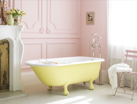
Catchpole & Rye, purveyor of fine sanitary ware for luxurious bathrooms, offers its ideas for updating the ‘smallest room in the house’ this spring using pastel colours.
Spring is in the air, and in fashion and interiors that means one thing: a proliferation of pastels! When it comes to the bathroom, however, a gentle, muted colour palette is not just for warmer months – it works wonderfully all year round, creating a peaceful, tranquil ambience in a room made for relaxation and indulgence.Traditionally seen as feminine, romantic and perhaps a little saccharine, pastels are finally showing their more versatile side. Pastels also look fabulous paired with metallics such as brass and copper – another sign that they’re a great choice for bathrooms.
For a gentle introduction to this look, stick to a neutral palette for a bathroom and introduce the chosen pastel as for any accent colour. Catchpole & Rye baths can be painted any shade chosen: powder blue, muted mint, lemon yellow or coral pink, a crisp background will stop the overall scheme from appearing too sugary sweet. The room pictured top looks so inviting – the pale walls and floor create a serene backdrop for the soft blue bath.
Ice-cream shades can help to counter the clean lines and hard surfaces of a bathroom, softening the space and adding a fun, quirky edge. For those who have had their fill of industrial chic, this could be the perfect antidote!
By painting the bath a slightly paler tint of pink than the walls, it is given subtle prominence in a sophisticated scheme.
Of course, it doesn’t have to be the bath that takes centre stage – cisterns and vanity units can also be painted to suit a scheme where pastel tones add a splash of individuality without overpowering the room.
Adding vibrant bright or dark, moody colours into the mix brings pastels bang up to date. As well as creating a strong sense of drama, an atmospheric wall colour adds definition to a pistachio green bath, the contrast heightening the intensity of both colours and giving the paler shade more gravitas. Colour layering in this scheme could have a touch of the tropical about it – perhaps a fearless combination of zesty orange, sky blue and sunshine yellow would feel joyful and full of fun.
See the Catchpole & Rye website for more information and inspiration.
Catchpole & Rye
Website: www.catchpoleandrye.com
Telephone: London showroom 020 7351 0940
The secret of great interior design
19/04/17 17:16
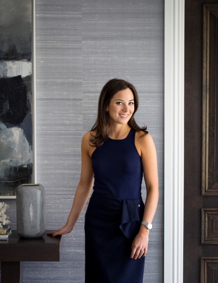
Interior designer Sophie Paterson talks to Jane Pople about the secrets of good interior design and how she overcame career challenges to be where she is today.
Sophie Paterson has an enviable combination of tenacity and business acumen, coupled with wonderful creativity and a natural talent for style. These skills have seen her rise through the ranks to head her own studio, Sophie Paterson Interiors, and become renowned across the industry. Her portfolio boasts many stunning projects that range from a luxury Chelsea apartment to a sprawling urban family home.Q Sophie, what is the secret to interior design?
A I’m not sure it’s a secret, but I think the key is really prioritising the functionality of the space and not just going for something that will look good in a photo. Having lived in various properties I have designed, I’ve learnt on a personal level how important comfort and practicality can be. Small things like having a table in reach of all your chairs so you can put down a drink, having fabrics that don’t give you a nervous tick every time someone sits on them, sofas that feel comfortable to sit on, rugs that disguise stains, wall coverings that resist scratches and marks. I think if you are designing high-end residential projects and you haven’t lived in one of your designed interiors, you could be tempted to prioritise aesthetics over functionality which is never the correct choice. Every client and every home needs to take practicality and comfort into account in order to be truly luxurious. Otherwise you are just living in a show home not a real home.
Q What was the biggest challenge you faced when setting up your own interior design studio?
A There were many challenges ¬– obtaining trade accounts is one hurdle that springs to mind – you need trade account references to set up most trade accounts, so convincing the first fabric house to give a trade account is hard work! I remember being interviewed by Zoffany and Andrew Martin for a trade account, which was daunting at the time. Now I look back and think what was I worried about, but you have to constantly push yourself to grow, so things I used to get phased by don’t even register with me now as a stressful situation. When I look back, I think it’s a blessing that at the tender age of 24 I didn’t fully realise everything that was involved in setting up and running a successful design studio!
Q What is the best advice anyone has ever given you?
A Stop worrying about everything that could go wrong and start thinking about all the things that could go right. In reality, you will find a solution to any problem you come up against. If you think about everything that could go wrong, you’ll end up procrastinating or even failing to try.
Q How would you describe your own home style and what’s your favourite room?
A My home is classic contemporary with a little rustic chic thrown in. My favourite room is either the kitchen or my TV room because they are so relaxing to spend time in. My TV room has layers of gorgeous textures and comfort; my kitchen is such a great space for socialising. I love the views across the garden from all the French doors.
Q If you could design the interior for any space in the world, where would you choose?
A I get asked this question a lot. I don’t have a particularly interesting answer. To me the ideal project isn’t just about the building, it’s about the combination of the building, client, brief and budget. If you get all those things right, then magic happens!
Q What is your favourite type of project to work on and do you have a most memorable project?
A I like working on complete refurbishments where you get to see a total transformation, and I prefer to work on whole houses or apartments rather than just a few rooms, as I always feel the rooms that are left feel even worse after you’ve renovated the others to a high standard. One of my most memorable projects was designing the nursery for our Cobham project after the rest of the house. We had left this room earmarked as a future nursery. Unveiling the room to the clients was such an emotional experience. They were in tears, we were in tears and even our builder was spotted wiping a tear away! It was such a special room and turned out beautifully. Another noteworthy experience was the recent handover of a Knightsbridge apartment project. The client was very trusting and didn’t visit the project once in the year’s renovation. When we handed the turnkey project over even their personal photos were in the photo frames, candles lit and flowers in the vases. The client’s reaction was just so special and to see how much they loved it is why we all do this job.
Q How would you spend your dream day off?
A If I was in London then I’d either go to Scotts, Zuma or Roka for a long lunch with my husband and baby daughter. Food is one of my passions – often I can be eating one meal whilst planning my next! After that I’d check into the spa at the Corinthia for some pampering. The interiors and treatments there are spectacular.
Q Where is your favourite place in the world?
A One place where I really relax and switch off is my in-laws’ home in Ranch Santa Fe in California. The weather, the beautiful location with gorgeous beaches so nearby, the food, the activities (I love tennis, hiking and shopping!) and company is a great combination. I generally don’t like staying in hotels, so this is one of my favourite places to go to switch off.
Q What are your top three tips for interiors in 2017?
A Embrace metal finishes such as bronze and antique brass. Not only are they more fashionable than chrome, but this is a trend that has longevity – it’s a classic look so won’t look dated in five years.
Colour wise, I love burgundy red, as well as warm tones such as almond and rust on a neutral base.
Q What would you be doing if you weren’t an interior designer?
A Good question. I really don’t know! I love organising things and I’d also need something creative.
Q What does the future hold for Sophie Paterson Interiors?
A We are completing some very large projects this year: a multi-unit project in Marylebone comprising a townhouse, an apartment and all the communal spaces within a high end development, a 13,000 square foot new build house in Chelmsford, an apartment in Marbella, a Grade II listed apartment in Knightsbridge, an apartment in Mayfair and a Grade II listed apartment in Belgravia. We are also expanding our team to allow for the large new projects we have lined up for later this year, so exciting times.
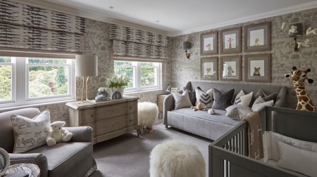
Website: www.amara.com and www.sophiepatersoninteriors.com
This article first appeared in The Lux Pad, www.amara.com/luxpad
Design in partnership
12/09/16 13:31
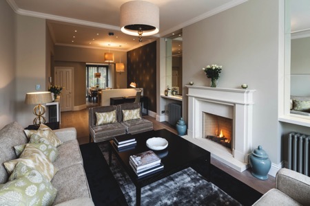
Interior designer Ruth Marshall discusses the reasons for engaging professional advice before commencing work on an interior design project.
Whether planning to refresh rooms or embarking on a more extensive refurbishment, you may wonder whether it is a worthwhile investment engaging a professional interior designer. Planning a new space can be daunting, and you may have concerns that a designer will ‘take over’, or that you could lose control of your budget. In reality, hiring a professional can save valuable time, help avoid costly mistakes and generally make the whole process less stressful and
more enjoyable.
The relationship with a designer is a partnership, with a shared vision to create something unique that reflects your tastes and personality. A designer’s experience and product knowledge helps narrow down choices and show what will work in your space, introducing niche products to make all the difference. They’re able to tailor projects to take account of specific requirements with custom-built joinery, beautiful bespoke upholstery and soft furnishings, and will have longstanding relationships with trusted professions and tradespeople. Don’t be afraid to ask for references if you want to be really sure.
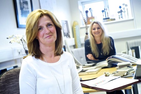
Our aim at Ruth Marshall Interior Design is to make the design process as stress-free and enjoyable as possible for our clients, combining luxury and comfort to create timeless, beautiful interiors in our signature classic contemporary style.
Our initial consultation is a friendly meeting of minds to explain how the design process works, understanding your lifestyle requirements. We’ll discuss budgets at this point too, as this will influence the choice of the best suppliers.
We’re often asked about current styles and whilst we love to keep abreast of interiors’ trends, it’s our view that it’s more important to ensure any new space is well planned, functional and flows with the rest of the house – it won’t look or feel quite right if one room has a completely different style and feel to the rest.
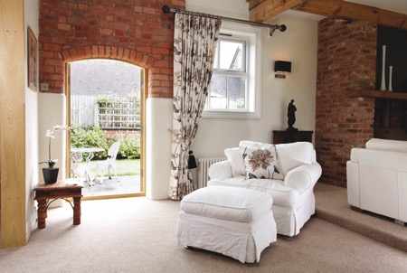
We’ll be taking a look at current and upcoming trends in essence magazine’s Interiors Supplement next month, so if you are about to embark on an interiors’ project it will be an interesting read.
essence info
With over 15 years of interior design and bespoke luxury soft furnishings experience, Ruth Marshall Interior Design offers the highest level of service from initial design through to final installation.
Websites: www.ruthmarshallinteriors.com
Email: studio@ruthmarshallinteriors.com
Telephone: 0203 590 6728
Translating art into cushions
08/04/16 11:41
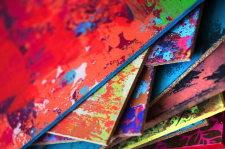
Fashion editor turned home accessory designer Susi Bellamy has a host of inspirational experiences to draw on. From working with legendary photographer David Bailey to living in Florence for six years, this former Condé Nast employee has brought art to the sofa in the form of her stunning cushion line. Here she chats to Jane Pople about why she left the fashion magazine world to set up her own brand and shares her top three tips on revamping a living space.
Photos copyright: Peter Atkinson
Q You used to work as a fashion editor at Condé Nast publications; how and why did you first get into the fashion industry?
A I studied fashion journalism at the London College of Fashion and when I graduated at 21 I was taken on as a fashion assistant on a London magazine. However, after a couple of shoots on my own, they made me the fashion editor and I never looked back. I had done some work experience when I was at college at Brides Magazine at Condé Nast and a few years later they invited me to interview for the job of fashion editor. It was wonderful working there and a naturally happy environment considering the subject matter. I spent every December in the Caribbean photographing the summer issues and was lucky enough to also work with David Bailey, Norman Parkinson and Lord Snowdon to name a few. Also, we were one of the first magazines to use Kate Moss as a model when she was only 16. Working behind the camera definitely helped me as an artist in the future with a view to composition and colour. It has informed my work ever since.
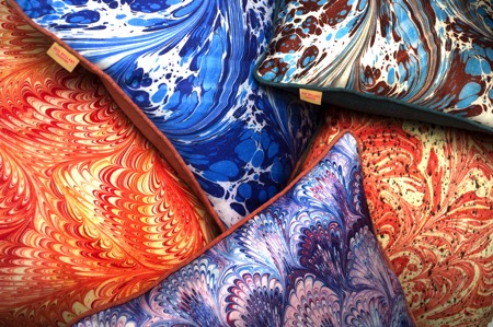
Q What led you to leave the fashion world behind to pursue design and setting up your own brand?
A I left the magazine world after my first child, Jack, was born and my husband was posted to the States for his work. This secondment didn’t include a green card for me, so I took up painting as a hobby. I never stopped painting and after years of practice as an artist I eventually completed an MA in fine art in 2013, which led to me having my own studio in Newcastle. It was only 11 months ago that I set up my own brand when I decided my artwork could translate well into cushions.
Q Can you tell us about your time living in Florence? Would you say that has inspired your designs today?
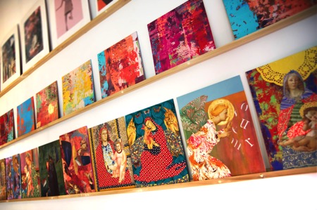
A Living in Florence for almost seven years was like a dream come true. I was not only inspired by the history of the city, but also by the fashion and the Italian innate sense of colour. When I created my Madonna series of collages, inspired by the street corner shrines, I worked closely with an artisan framer whose ability with carving and gilding had been handed down for generations. Living and working in such an environment was a daily inspiration and has informed all my work since. The crumbling plaster of the palazzo walls and the beautiful countryside also inspired my abstract work which I create using a plasterer’s trowel to give a textured and layered effect.
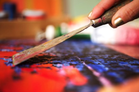
Q Why did you decide to create a line of cushions, and can you tell us about the design process from initial concept to finished product?
A I had created some large paintings on wood in my studio and I think it was my background working on magazines that led me to edit and crop them. So I took the large painting downstairs to the woodwork studio and asked them to cut it up into eight equal squares. I placed this work on a shelving system I have in my studio and studied them for a while. It then became apparent to me that they could possibly work well as cushion designs and the rest is history. I carried on working on some of the crops and left others – I then photographed them and had them digitally printed using dye-sublimation printing (this high quality process harnesses the rich texture of the artwork onto a silky flat surface) by a British printer in Nottingham. I found this the best sort of printing to harness the colour. I also work from marbled paper I had produced in Florence to create a second range of cushions which I felt worked well with the abstracts. All the cushions are piped, which gives a frame-like effect to the printed artwork, and the backing fabric is chosen carefully to complement the colour palette. This led me to describe them as ‘art for the sofa’. I enjoy the transition from 2D to 3D.
Q All of your cushions are made in England. Is that something that is important to you?
A It is very important to me that my product remains very British. Quality is of the utmost and I didn’t want to compromise that by printing abroad where I had no control over the process. I also feel proud to be showing my work with integrity and supporting our economy.

Susi’s top three tips for revamping a living space
Colour – colour can transform a space and be uplifting. There are so many beautiful colours to choose from, but I particularly like the tertiary tones – the ones that are slightly slubby and toned down versions of the primaries.
Interesting and eclectic art and objects – I love to mix old and new, traditional and abstract. It adds a twist to an interior. I particularly like sculptural objects on plinths.
Lighting – a good mixture of lighting adds mood and allows change.
Q Can you tell us about your work with The Colour Group?
A The Colour Group (GB) is a non-profit organisation that promotes colour education and shares information to anyone interested in colour. A lot of the members and committee members are scientists and they approach colour from a completely different angle to me, but I was brought in to help organise events around art and fashion. I have organised art workshops, lectures at the Tate Modern on Malevich and Sonia Delaunay as well as a science event in Newcastle. We meet at City University in London once a month and it has opened my eyes to many aspects of colour and a broad range of interesting people. You could describe us as ‘colour nerds’!
Q What is your most treasured possession and why?
A I have a copy of a Michelangelo bust in gesso that an Italian friend of mine made in Florence. Her father had owned a shop in the historic centre and owned moulds of Renaissance sculpture – the father died and the shop closed down, but every time I look at it I am transported back to Florence and the Bargello (sculpture museum) and the Uffizi. I can even smell the coffee!
Q How would you describe your own home style and what is your favourite room in your house and why?
A I would describe my home style as classic with a twist and full of colour. We live in the main wing of a large house in the Tyne Valley near Hadrian’s Wall, and my favourite room is my kitchen as it has uninterrupted views from a bay window across the valley with not one blot on the landscape and a great view of my neighbour’s beautiful horses. The kitchen was handmade by a local Northumberland craftsman and has lovely high ceilings and original coving. It is also painted in various ‘shades of grey’, but then punctuated by brightly coloured ticking, faux coral sculpture and Tuscan pottery. In the same way as I was keen to have my cushions made in the UK, I also have worked with local craftspeople on my home. We have so much talent here.
Q What has been the hardest part of setting up your own brand and so far what has been the most rewarding part of the experience?
A The hardest part of setting up my own brand has been working to get things right and making mistakes. It is not just the creation of the design and the choosing of the backing fabric, but the whole infrastructure of building a brand and the everyday practicalities such as postage and packing that need to be addressed. The most rewarding part of the experience has been when I have received positive responses to the range and the few times I have been lucky enough to get some lovely press.
Susi’s cushions are filled with an over-stuffed duck feather filling. Beautifully made, they work visually as groups of contrasting designs, or used alone in conjunction with plains for a more classic look. The combination of uniqueness, colour and vibrancy will impact on any interior in the same way as a piece of artwork. Susi has an MA in fine art from Northumbria University which culminated in a degree show at Baltic 39 in 2013. She now works from Cobalt Studios in the Ouseburn, Newcastle. Discover Susi Bellamy’s beautiful range of cushions now available at Amara: www.amara.com.
About Jane Pople
Jane Pople has over five years experience writing about interiors and the design industry favouring emerging designers and new talent. This article first appeared in The Lux Pad, www.amara.com/luxpad.
Bespoke bedrooms
02/12/15 13:25
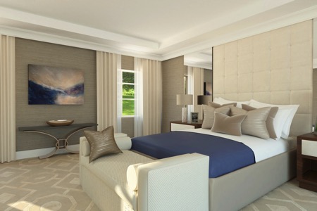
A beautiful bedroom, custom designed to meet exact personal requirements, is high on many wish lists. Jenny Allan from JCA Interiors explains why bespoke is best.
When using the services of an interior designer, it offers the opportunity to have a space designed which is bespoke and completely unique. Elegant, classic, contemporary rooms can be created without sacrificing comfort and functionality.
Bedrooms are prime examples where comfort and style need to blend seamlessly together. These spaces have a real impact on wellbeing and the importance of an effective, peaceful and beautiful design should not be underestimated.
Look for inspiration in the world around, in items that evoke a sense of happiness and luxury. Take reference from nature, travel or even a favourite designer handbag. A room can be designed from referencing a style of a preferred fashion designer, encompassing the essence of his or her collections, as well as the feel of their boutiques to create a real luxurious atmosphere that can be experienced at home, not just in Bond Street!
Once a theme and overall look is decided upon it is then time to focus on layout and individual elements. A comfortable luxurious bed is the central pivotal point within the design and should be made the star of the show. The key to making the bed a focal point is to include an impressive headboard. A full wall, statement piece will give a really striking look and become an item of interest in its own right. Headboards can be created out of fabric wall paneling as well as a combination of mirrored panels and even LED lights.
The headboard will form a dominant part of the colour scheme and its tones should be used in the fabrics of cushions, bedlinen and other upholstery in the room. It is advisable to employ a predominantly relaxing neutral palate, perhaps with accents of calming blues or purples. These colours can then be incorporated into artwork and other decorative accessories to create a really cohesive design.
When choosing furniture be selective and don’t overcrowd the space. Include a few luxurious key pieces which have merit functionally and aesthetically. Bespoke bedside tables, perhaps with fabric or metal inlay, will look stunning and increase the beauty of the design. Depending on the size of the room, it may be suitable to include a relaxing seating area.
If there is space for a separate dressing room, this is ideal for recreating the boutique feel. Storage space can be specifically designed to organise handbag and shoe collections so their beauty can be appreciated even when they are not being worn. Space should be allowed for additional purchases so the room is futureproof as well as suitable for current pieces.
A stunning, bespoke bedroom can become a relaxing sanctuary, a form of escapism from the outside world. When the space is well designed with adequate storage and perfect balance of colour tones and custom made elements, it really becomes something rather special.
JCA Interiors
Jenny Allan is founder of interior design company JCA Interiors
Telephone: 020 3714 9325
Email: info@jcainteriors.co.uk
Website: www.jcainteriors.co.uk
Elegant dining
10/11/15 13:55
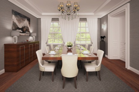
A beautiful dining room should give a sense of occasion and grandeur. Jenny Allan from JCA Interiors offers advice on designing the perfect entertaining space.
As dining rooms are typically used in the evening, there is an opportunity to use a moody, rich colour scheme in the interior design. Dark greys and taupes will always look elegant and provide the ideal backdrop for statement pieces of artwork or sculpture.
Dining room furniture must be practical and comfortable, as well as stylish. Chairs should be high quality and comfortably seat diners for a few hours over the course of an evening. When planning a dining room design consider the maximum number of chairs required. Some designs suit a set of matching chairs, while others can be enhanced by adding an oversized chair at either end of a table to add flair.
There is a multitude of beautiful fabrics to choose from when deciding on upholstery. Adding studded details or a spectacular fabric to the backs of chairs will create a very special design and take a room to the next level.
For added flexibility in a dining room consider buying an extendable table. This will offer a good solution for entertaining six people of an evening and then twelve at Christmas. Having options is always helpful, however, be sure to have enough stylish dining chairs so the look is cohesive whatever the occasion.
Commissioning a bespoke dining table is the perfect way to make a dining room an incredibly special place. A stunning table made out of luxury materials such as beautiful hardwoods, possibly with marquetry or inlay, is the ideal focal point in a room and will be a great investment piece that can be passed down through generations.
A matching credenza will also add to the luxurious style and is very useful for storing tableware, glasses, cutlery and table linen. It can also be an anchor piece within the room making the dining space feel more complete, rather than just having a table and chairs.
To further enhance a design, effective lighting is essential. Mood lighting will help to create atmosphere, while statement lights such as crystal chandeliers hung over the table will create drama. Depending on the length of the dining table, consider hanging two or three statement light pieces above. This can work well and give the room an even more striking appearance.
When designing a room it is important not to overlook accessories and finishing touches that complete the design. Accessories are like jewellery and rooms can feel bare without them. Dressing the table in a stylish way is the icing on the cake and can transform the space. There are many choices of tableware and it is really down to personal preference. Just ensure it complements the overall design. Finish with a large, beautiful floral arrangement placed centrally on the table or perhaps place three smaller vases with roses down the length of it to elongate the room.
A stunning dining room should be an uplifting, dramatic and elegant space: a place to invite friends and family, a room which can be enjoyed by all and which makes special occasions even more memorable.
JCA Interiors
Jenny Allan is founder of interior design company JCA Interiors
Telephone: 020 3714 9325
Email: info@jcainteriors.co.uk
Website: www.jcainteriors.co.uk
Making and entrance
07/10/15 12:05
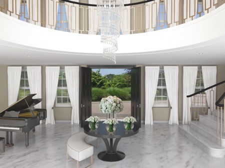
Entrance halls offer the chance to make a statement, to set the scene for the rest of the home. Jenny Allan from JCA Interiors explains how to make sure this area gives that great first impression.
When designing a whole house the entrance hall is always the first place to start as it is the central pivotal point of the home and sets the scene for the rest of the design.
The style must be cohesive with other principal rooms which lead from the hall as there will be internal vistas through to those rooms when doors are open.
An essential part of creating a stunning entrance area is an impressive front door and it should look good from the inside as much as outside. It must be in proportion and complement the architecture of the property whilst being inline stylistically with the rest of the interior.
A further essential consideration, at the central core of the property, is the staircase which has the ability to be an incredible design feature. A multitude of choices are available in all different finishes: from floating wooden treads to marble helical staircases, there is an opportunity to create a real statement feature that will be the focal point of the house.
Good lighting is also critical in the successful design of an entrance hall. A chandelier or modern piece of designer lighting creates impact and can make a powerful first impression. The proportions of double height entrance halls should be enhanced by this feature light which encourages the eye to be drawn upward, emphasising the height and space on show. Further wall lights or downlighters can be incorporated to balance the powerful centrepiece ensuring all areas have adequate light.
Creating a flow through the house is an important part of an effective design. This should be felt from the moment the front door is opened and furniture selection in an entrance hall is a key part of this. Mirror the shape of the hall with a console or central table which is attractive, but easy to walk around. If the hallway is a large area, it is important for the space not to feel empty and sparse, so ensure there is enough furniture and features to make it feel homely. In some cases it may be appropriate to add a seating area or even a grand piano to complete the design.
The entrance hall can be an ideal place for prized pieces of artwork or sculpture as there will be enough space around them so they are displayed and shown in their best light. Adding these pieces will offer the perfect finishing touches to an area of the house which has the potential to ‘wow’ visitors and create a stunning first impression.
Elegant, characterful or imposing, perhaps a mixture of the three, there is a myriad of options for creating a successful entrance hall, but just ensure it relates in a holistic way to the interior design of the rest of the house.
JCA Interiors
Jenny Allan is founder of interior design company JCA Interiors
Telephone: 020 3714 9325
Email: info@jcainteriors.co.uk
Website: www.jcainteriors.co.uk
Autumn style
11/09/15 12:19
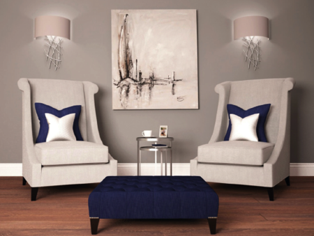
Jenny Allan from JCA Interiors offers advice on how to keep home interiors on trend this autumn.
The current go-to theme for interior wall colours is grey: think winter morning grey with a hint of taupe. Its understated and sophisticated shades make it a very versatile colour that works as the optimal back drop for most rooms. Greys can be warmed or cooled depending on the combination of colours chosen and their tone will also vary according to the amount of light in a room.
As an on trend accent colour which can be combined with grey, midnight blue is the ideal companion. Relaxing, calming and sophisticated, midnight blue is the perfect way to add a touch of colour to an interior. Use it for velvet cushions, decorative accessories or for a bolder look on walls or as a curtain fabric. Other autumnal hues that combine beautifully with grey are rusty orange tones. Think burnt orange, russet or chestnut to add warmth to a space and give a room a cosy, inviting glow.
Warm tones even continue into metallics with copper and brass being the go-to metals this season. They can be implemented in varying degrees from decorative accessories to a nest of side tables or a coffee table depending on the type of interior.
This autumn’s throws, rugs and cushions are plush, sumptuous textures such as faux fur and velvet which combine well with the beautiful blues and stylish greys. Choosing a mixture of soft, warm textures to layer throughout a scheme will add depth to a room. Drape fur throws over the end of a bed or sofa as the finishing touch to a room’s design.
There’s an air of nature about this season’s interior design: think country home with an urban twist. With dove grey, mocha and taupe tones, materials of the moment are rustic and natural such as worn woods, chunky knits and herringbone tweeds, ideal for a cosy, comfortable autumn interior.
Warm wools and traditional tartan are also very fashionable, ideal for upholstery and will combine well with other on trend pieces. Mulberry Home has some beautiful tartan accessories that will blend with every autumn colour scheme.
Inspired by The Great Gatsby and Downton Abbey, art deco furniture pieces with opulent metallic tones are currently in vogue and add a certain glamour to any interior. The bold geometric shapes, often arranged in symmetrical patterns, work well in modern and traditional homes giving an atmospheric hint of the roaring twenties.
Another autumn theme is the statement chair, the perfect place to curl up by the fire and read a good book as days grow colder and nights draw in. From high wing backed chairs to a simple occasional chair, a pair of statement chairs will create maximum impact and make a fashionable but also timeless addition to any home. Upholster in tartan, herringbone tweed or fine wool to create the ultimate autumnal design piece.
This autumn’s interior trends will suit all types of homes making September the ideal time to redesign and transform an interior.
JCA Interiors
Jenny Allan is founder of interior design company JCA Interiors
Telephone: 020 3714 9325
Email: info@jcainteriors.co.uk
Website: www.jcainteriors.co.uk
Summer living
14/07/15 10:41
A new season deserves a new look; Jenny Allan from JCA Interiors explains how interior and exterior spaces of any home can be adapted to make the most of long summer days.
An effective interior design should mean that rooms can be changed easily to fit the current season. When creating a summer time feel, draw inspiration from outdoors, beach holidays and florals. Light, bright interiors with natural materials and a seasonal palette will make a home feel ready for the warm months ahead.
Small changes can transform rooms such as replacing velvet cushion covers with linen and packing away fur throws and heavy duvets. Darker colours should make way for whites and sand tones as using large amounts of white fabric can help to convert a room from a cosy winter space to an airy summer sanctuary.
Blue accent colours can really bring a seaside or tropical feel to an interior, from turquoise to azure from sky blue to navy, blue is very on trend this season, so look to include it within the updated design. Evoke memories of blue skies from summer holidays with bright blue accessories or layer different shades of blue cushions on a white sofa to create a fresh summer vibe.
Simple touches such as changing artwork to beach or floral themes will be an instant update that can easily be swapped or moved around once the season changes. Floral arrangements will also affect the feel of a room, so choose a summer bouquet with roses, peonies or hydrangeas to start the summertime transformation. For more summery additions, accessorise with items such as white ceramic vases, resin coral and mother of pearl photo frames to create a beautiful glamorous feel.
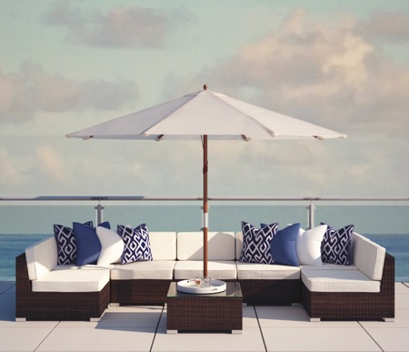
Given that most of us prefer to spend time outside during summer, designing the perfect garden retreat is essential to making the most of sunny days and warm, balmy evenings. Updating terraces and outdoor seating areas with interior qualities will create an exterior ‘room’ that will be a pleasure to sit in. Rattan is a popular choice as it is stylish and weatherproof, however, metal or teak furniture also suit a more traditionally designed home.
Consider the layout of outdoor seating areas in the same way an interior room would be designed. The space would ideally have an eating area, seating space and loungers for sunbathing, so almost three rooms in one! Clever, subtle lighting with the addition of outdoor warmth such as a gel fire will look inviting in the evening and can be used to bring the outdoor design together, creating a cosy atmosphere.
Accessorising a terrace as an interior really helps to make it a beautiful, attractive area. Brightly coloured cushions or fabrics with patterns such as chevrons can lift the space and add vibrancy. Adding a selection of coloured glassware and jugs to the table and a bright summer floral bouquet will also bring it to life and offer a holiday feel.
These changes to the interior design and outside space will ensure that a home adapts to brighter, longer days and feels perfect for enjoying summer living throughout the warmer months.
JCA Interiors
Jenny Allan is founder of interior design company JCA Interiors
Telephone: 020 3714 9325
Email: info@jcainteriors.co.uk
Website: www.jcainteriors.co.uk
The home office
02/07/15 08:11
