Amara
Tradition and cutting edge
Internationally known for its excellence and creative spirit, it’s the passion and skill of the hands of those who work the ceramics that is at the heart of Bitossi Ceramiche. Jane Pople takes a close look at the renowned brand.
Combining the traditional art of ceramic making with cutting edge style has been the aim of Italian brand Bitossi Ceramiche since the early 1900s. This prestigious brand’s long history is founded on a profound understanding of the material, and its natural propensity for experimentation. The brand’s roots stem from the productive ceramic tradition that existed in Montelupo Fiorentino from the 1500s. Tracing its beginning in ceramic production to as early as 1871, the Bitossi family business has centuries of expertise.
Guido Bitossi was heir to this long ceramic tradition and established the ‘Manifattura Maioliche Artistiche’ in 1921, a centre featuring typical local craft works. Thanks to the art direction of Aldo Londi, traditional production methods and procedures were renewed, and really this was the beginning of Bitossi Ceramiche as we now know it today.
Aldo’s meeting with the now iconic architect Ettore Sottass marked a significant turning point for the brand and this important encounter led to a close collaboration with Londi for many years. Together, this visionary duo created many successful designs and continued to expand their skills and creative genius. Bitossi Ceramiche is still in the original factory today, and it is still the go-to brand for leading designers fascinated by the historical value of the company, by craft production and the creation of unique collections.
Since 1871, the Bitossi family has collected over 7,000 historical works, documents and material related to artistic ceramic production. This vast archive is an attempt to preserve and valorise the historic memory that the family has been collecting over the years. The Archivio Industriale Bitossi (Bitossi Industrial Archive) spreads over seven rooms in the historic Colorificio building near to the factory. This collection also includes important ceramics and documents from other factories, in particular those from the Florentine ceramics area. In order to safeguard the heritage of this important area and its work in ceramics, the Vittoriano Bitossi Foundation became involved in 2010. One of the Foundation’s statutory purposes is precisely: “the preservation and valorisation of the history of artistic ceramics in the Florentine territory.”
The Foundation’s main sponsor is the Colorobbia Group and its chief purpose is the enhancement and dissemination of the ceramic culture, historical research and scientific research. It promotes cultural initiatives involving modern and contemporary art, also on the international scene. In addition, it performs supporting activities in the health sector in ceramics districts where the Group’s companies are located.
In 2003, the MAIB – Museo Artistico Industriale Bitossi (Bitossi Industrial Art Museum) – was opened to house this collection. Temporary exhibitions offer various insights into production periods and styles linked to the talent of Aldo Londi, the company's historical art director, and also into design. The museum and archive are run by the Foundation, a direct offshoot of the Bitossi family.
The Bitossi Artistic Industrial Museum opened in 2003, and is world renowned as an industrial museum that exhibits artistic ceramics productions of the twentieth century, and in particular, from the mid nineteen-fifties up until the present time. It currently covers two rooms in a historic 1929 building, which was the first site of the Bitossi factory.
The Museum organises temporary thematic exhibitions mainly on the huge historical production heritage with displays of the factory's production. It also houses exhibitions of architects and designers who have worked with the company.
The Foundation, the Museum and the overall winning identity of Bitossi Ceramiche is thanks to unprecedented entrepreneurial skills developed throughout the years and constant research for the utmost quality in each and every product.
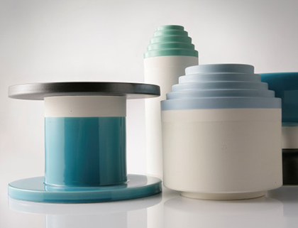
One of the strongest examples of Italian excellence, Bitossi Ceramiche’s business approach of focusing on craftsmanship has brought it to the attention of many outstanding designers who expressed in the medium of ceramic a special creativity well suited to the material, resulting in a number of timeless icons. One of the most renowned ranges from Bitossi Ceramiche is Aldo Londi’s Rimini Blu. These blue designs with ‘waived’ pattern continue to fascinate consumers across the world and there is a vast range of designs and sizes to choose from.
Another highlight from Bitossi Ceramiche’s contemporary offering is Karim Rashid’s range, Symbolik. Comprising numbered vases, totems and bowls, it has been inspired by the colourful Sottass totems and it introduces the language of signs, one of the main features of the Egyptian designer. Invest in authentic Italian craftsmanship and discover the world of Bitossi Ceramiche now available at Amara.
essence info
Bitossi Ceramiche is a new addition to the Amara brand portfolio.
Websites: www.bitossiceramiche.it, www.amara.com
This article first appeared in The Lux Pad, www.amara.com/luxpad
Room with a view
07/10/16 20:28 Filed in: Property
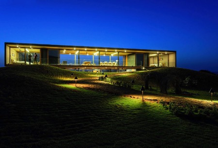
It’s not always and only about how large a house is, whether it offers floor plans inviting visitors to enjoy sea breezes, mountain mornings, or the pastoral peace of the countryside, views do matter. Jane Pople finds some houses with the most spectacular panoramic views. This stunning collection of properties, most situated on challenging terrains, offer great views and all are true pieces of architectural genius.
House Holman
Picasso inspiration - Australia
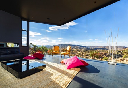
A top the 70-metre high cliffs of Dover Heights, Australia, rising steep over the ocean, stands the futuristic structure of the House Holman private residence with a crisp white silhouette cutting in the vast background of the deep blue sky. The house has been developed by Durbach Block Jaggers Architects who have designed its plan inspired by Picasso’s surreal painting The Bather. Indeed, the structure of the building develops in a complex series of meandering spaces that arc, fold and stretch in response to landscape and views. The rough stone walls of the lower levels cut into the cliff, forming a solid base, and continue along the cliff edge to form eccentric terraced gardens and a vase-shaped rock pool.
Pretty Beach House
Modest name, top excellence - Australia
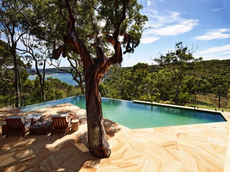
Pretty Beach House is a sophisticated, private guesthouse offering top quality services, modern amenities and luxurious ambiance, a private chef for exclusive gastronomic experience, breathtaking panoramic views, exciting private boat trips and a Zen-relax spa. The best part is that the house is designed, built and purposed to make guests feel at home in an intimate, safe and authentic environment, nestled in the serene and quintessentially Australian bushland. The property features a guest-shared main house and four exclusive private pavilions, all developed and furnished in a sophisticated style of charming elegance and luxury.
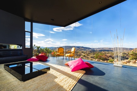
Black Desert House
The shadow of the mountain - USA
Pretty Beach House is a sophisticated, private guesthouse offering top quality services, modern amenities and luxurious ambiance, a private chef for exclusive gastronomic experience, breathtaking panoramic views, exciting private boat trips and a Zen-relax spa. The best part is that the house is designed, built and purposed to make guests feel at home in an intimate, safe and authentic environment, nestled in the serene and quintessentially Australian bushland. The property features a guest-shared main house and four exclusive private pavilions, all developed and furnished in a sophisticated style of charming elegance and luxury.
Panorama House
An idyllic dream - India
In an attempt to bring humans and their residences into a more intimate unity with nature, the team of Ajay Sonar has developed the Panorama House and placed it atop a small hill against the background of the Gangapur Dam in Nasik, India. As in an idyllic dream, the Sahyadri Mountain frames the beautiful scenery and incorporates the building within. With panoramic glass walls framed by a simple pigmented concrete cuboid shell structure, the house stands almost invisibly amidst the landscape, matching the colour of the surrounding soil and mountains, and allows residents to enjoy the magnificent performance of weathers and seasons in a picture perfect view.
The Summer House
The ‘living’ rock - Norway
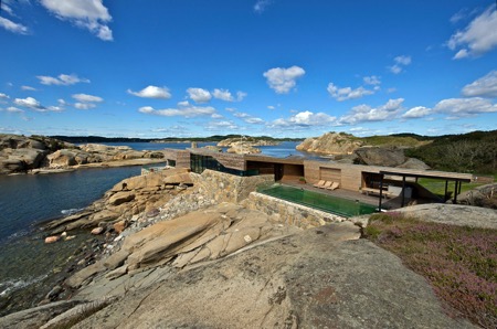
The Summer House, designed by JVA, stands among the rugged rock formations and huge boulders lining the coast of Vestfold in the southern part of Norway. It is a low elongated structure, looking itself like a ‘living’ rock for being perfectly adjusted to the surrounding terrain in terms of shape, scale, material and colour. The overall shell of the building is divided through cuts-in to allow for wind shielded outdoor areas protected by the house itself. The house offers an infinity pool and a large terrace overlooking the spectacular North Sea, protected from harsh sea winds by a glass wall, which allows unobstructed panoramic views.
Mirage
Aegean dream - Greece
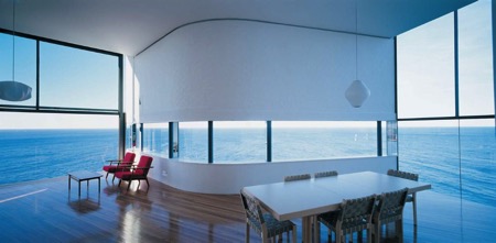
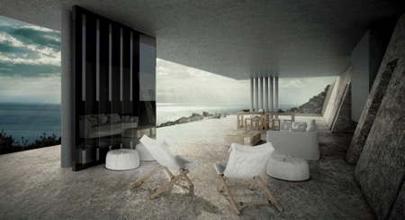
Walking along the edge of the steep, rocky shores of Tinos Island and enjoying breathtaking views to the Aegean Sea, there is a sight that will stop the wanderer and make him consider whether what he sees is a mirage or reality. A large piece of a water mirror extends to the horizon, vanishing and merging with the seascape, creating a stunning mirage vision. Yet it is very much real: an architectural masterpiece created by Kois Associated Architects and integrated into the landscape as if it was part of it. The rimless pool itself is a roof covering the large open space living area, while the rest of the premises are built into the rock itself, ‘disappearing’ into the scenery. Local building techniques and materials have been used to ensure proper temperature regulation and protection from weather and solar radiation.
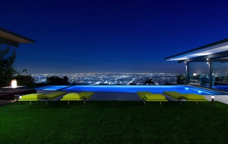
9010 Hopen Place
Matthew Perry’s Residence - USA
Located atop Los Angeles’ luxurious ‘Bird Streets’ neighbourhood, the Hopen Place Residence is known as one of the most prestigious properties on the Hollywood Hills and home of the actor Matthew Perry, star of ‘Friends’. The amazing three bedroom, four bathroom, 4,000 sq. ft. residence is a sleek architectural artwork, developed for a lavish Hollywood lifestyle, and boasts top-of-the-line amenities, deluxe interior design and unparalleled comfort. A custom made sliding glass wall opens the living area and leads into a sensational central courtyard featuring a solar and gas heated spa, revealing stunning jet-liner city views to downtown LA and the Pacific Ocean over the blue cascading waters of a dazzling ‘wet edge’ infinity pool.
essence info
Websites: www.amara.com and www.adorable-home.com
This article is contributed by Adorable Home Magazine and first appeared in The Lux Pad, www.amara.com/luxpad.
Creative class
10/07/16 07:20 Filed in: Property
Frequently featuring in top interior designer and design firm lists, Sims Hilditch specialises in a broad range of private, high-end residential and commercial projects in the UK and Europe. Founder Emma Sims Hilditch’s multidisciplinary team focuses on combining integrated architecture and interior design with traditional craftsmanship and bespoke furniture design. With never a dull day in the studio, Emma explained to Emily Bird her favourite parts of a new project and what her team do to stay motivated.
Q Can you describe for us the Sims Hilditch signature style?
A We don’t have one signature look that we roll out regardless – if I have done my job really well, the result should appear effortless rather than overtly designed. We were once described as the interior design practice “that those in the know turn to for a breezy twenty–first century take on classic English style.” I like to think this encapsulates the brand. We believe good design can truly transform lives, and a successful project is all about making our clients’ homes work for their lifestyle.
Q How has your background in film production shaped your interior style?
A When I was working with Ridley Scott, I developed a love for light, colour and detail. It was a brilliant opportunity to learn about space on a greater scale.
Q How do you spend your perfect day off when away from the studio?
A I love spending time with my husband and our three children. It’s wonderful when we can all be together. My husband loves to sail so we often spend our weekends together at our beach house in St Mawes.
Q Who or what has been your greatest source of inspiration during your career?
A I’ve always been inspired by the design work of Michele Bonan, an Italian designer who works for very chic hotels in Florence, Capri and Rome. I also admire Axel Vervoordt for his understated but eminently chic interiors.
“Sims Hilditch has a natural empathy for space, light and proportion, which can clearly be seen in the finished interior...”
HOUSE & GARDEN
Q What is the most enjoyable part of an interior design project?
A There are many enjoyable moments. I love it all! Presenting design schemes, choosing beautiful antique pieces of furniture or seeing the client’s reaction after installation, it’s difficult to choose one.
Q And the hardest?
A Working within strict timescales. However, we are fortunate to have a wonderful team who, at times, seem to achieve the impossible!
Q Can you talk us through the interior design of your own home?
A Our home is tucked away in a valley. It’s such a wonderfully peaceful place and I wanted the design to reflect this. We actually found our home by chance while driving around the local area; however, it was a dilapidated building. After renovating throughout, it became my dream home. I loved using natural materials throughout: in particular wools, linens, stone and wood. Natural materials have an innate quality and timelessness, they bring texture and depth to any home.
Q What has been your most unusual/unique project to date?
A We recently completed a sixteenth century manor house which had previously had purple padded fabric walls and emerald green carpet. It was quite a transformation!
Q How do you keep your team motivated to ensure constant creativity?
A I love to encourage the team to visit new hotels and restaurants for inspiration. We also attend design shows and have regular team lunches at the studio.
Q What’s in store for Sims Hilditch in the next year? Do you have any exciting upcoming projects?
A We have lots of exciting things coming up. We’re currently working on a few different projects, including Laura Ashley’s former home, a Georgian townhouse in London, a Worcestershire manor house and a Knightsbridge apartment.
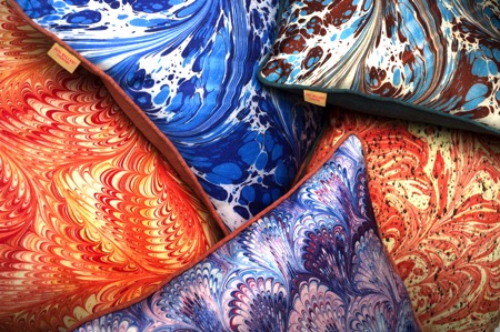
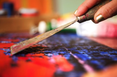
Translating art into cushions
08/04/16 11:41 Filed in: Interiors
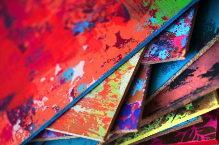
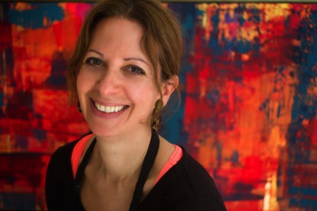
Fashion editor turned home accessory designer Susi Bellamy has a host of inspirational experiences to draw on. From working with legendary photographer David Bailey to living in Florence for six years, this former Condé Nast employee has brought art to the sofa in the form of her stunning cushion line. Here she chats to Jane Pople about why she left the fashion magazine world to set up her own brand and shares her top three tips on revamping a living space.
Photos copyright: Peter Atkinson
Q You used to work as a fashion editor at Condé Nast publications; how and why did you first get into the fashion industry?
A I studied fashion journalism at the London College of Fashion and when I graduated at 21 I was taken on as a fashion assistant on a London magazine. However, after a couple of shoots on my own, they made me the fashion editor and I never looked back. I had done some work experience when I was at college at Brides Magazine at Condé Nast and a few years later they invited me to interview for the job of fashion editor. It was wonderful working there and a naturally happy environment considering the subject matter. I spent every December in the Caribbean photographing the summer issues and was lucky enough to also work with David Bailey, Norman Parkinson and Lord Snowdon to name a few. Also, we were one of the first magazines to use Kate Moss as a model when she was only 16. Working behind the camera definitely helped me as an artist in the future with a view to composition and colour. It has informed my work ever since.
Q What led you to leave the fashion world behind to pursue design and setting up your own brand?
A I left the magazine world after my first child, Jack, was born and my husband was posted to the States for his work. This secondment didn’t include a green card for me, so I took up painting as a hobby. I never stopped painting and after years of practice as an artist I eventually completed an MA in fine art in 2013, which led to me having my own studio in Newcastle. It was only 11 months ago that I set up my own brand when I decided my artwork could translate well into cushions.
Q Can you tell us about your time living in Florence? Would you say that has inspired your designs today?
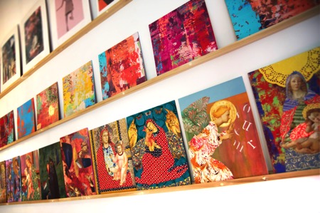
A Living in Florence for almost seven years was like a dream come true. I was not only inspired by the history of the city, but also by the fashion and the Italian innate sense of colour. When I created my Madonna series of collages, inspired by the street corner shrines, I worked closely with an artisan framer whose ability with carving and gilding had been handed down for generations. Living and working in such an environment was a daily inspiration and has informed all my work since. The crumbling plaster of the palazzo walls and the beautiful countryside also inspired my abstract work which I create using a plasterer’s trowel to give a textured and layered effect.
Q Why did you decide to create a line of cushions, and can you tell us about the design process from initial concept to finished product?
A I had created some large paintings on wood in my studio and I think it was my background working on magazines that led me to edit and crop them. So I took the large painting downstairs to the woodwork studio and asked them to cut it up into eight equal squares. I placed this work on a shelving system I have in my studio and studied them for a while. It then became apparent to me that they could possibly work well as cushion designs and the rest is history. I carried on working on some of the crops and left others – I then photographed them and had them digitally printed using dye-sublimation printing (this high quality process harnesses the rich texture of the artwork onto a silky flat surface) by a British printer in Nottingham. I found this the best sort of printing to harness the colour. I also work from marbled paper I had produced in Florence to create a second range of cushions which I felt worked well with the abstracts. All the cushions are piped, which gives a frame-like effect to the printed artwork, and the backing fabric is chosen carefully to complement the colour palette. This led me to describe them as ‘art for the sofa’. I enjoy the transition from 2D to 3D.
Q All of your cushions are made in England. Is that something that is important to you?
A It is very important to me that my product remains very British. Quality is of the utmost and I didn’t want to compromise that by printing abroad where I had no control over the process. I also feel proud to be showing my work with integrity and supporting our economy.
Susi’s top three tips for revamping a living space
Colour – colour can transform a space and be uplifting. There are so many beautiful colours to choose from, but I particularly like the tertiary tones – the ones that are slightly slubby and toned down versions of the primaries.
Interesting and eclectic art and objects – I love to mix old and new, traditional and abstract. It adds a twist to an interior. I particularly like sculptural objects on plinths.
Lighting – a good mixture of lighting adds mood and allows change.
Q Can you tell us about your work with The Colour Group?
A The Colour Group (GB) is a non-profit organisation that promotes colour education and shares information to anyone interested in colour. A lot of the members and committee members are scientists and they approach colour from a completely different angle to me, but I was brought in to help organise events around art and fashion. I have organised art workshops, lectures at the Tate Modern on Malevich and Sonia Delaunay as well as a science event in Newcastle. We meet at City University in London once a month and it has opened my eyes to many aspects of colour and a broad range of interesting people. You could describe us as ‘colour nerds’!
Q What is your most treasured possession and why?
A I have a copy of a Michelangelo bust in gesso that an Italian friend of mine made in Florence. Her father had owned a shop in the historic centre and owned moulds of Renaissance sculpture – the father died and the shop closed down, but every time I look at it I am transported back to Florence and the Bargello (sculpture museum) and the Uffizi. I can even smell the coffee!
Q How would you describe your own home style and what is your favourite room in your house and why?
A I would describe my home style as classic with a twist and full of colour. We live in the main wing of a large house in the Tyne Valley near Hadrian’s Wall, and my favourite room is my kitchen as it has uninterrupted views from a bay window across the valley with not one blot on the landscape and a great view of my neighbour’s beautiful horses. The kitchen was handmade by a local Northumberland craftsman and has lovely high ceilings and original coving. It is also painted in various ‘shades of grey’, but then punctuated by brightly coloured ticking, faux coral sculpture and Tuscan pottery. In the same way as I was keen to have my cushions made in the UK, I also have worked with local craftspeople on my home. We have so much talent here.
Q What has been the hardest part of setting up your own brand and so far what has been the most rewarding part of the experience?
A The hardest part of setting up my own brand has been working to get things right and making mistakes. It is not just the creation of the design and the choosing of the backing fabric, but the whole infrastructure of building a brand and the everyday practicalities such as postage and packing that need to be addressed. The most rewarding part of the experience has been when I have received positive responses to the range and the few times I have been lucky enough to get some lovely press.
Susi’s cushions are filled with an over-stuffed duck feather filling. Beautifully made, they work visually as groups of contrasting designs, or used alone in conjunction with plains for a more classic look. The combination of uniqueness, colour and vibrancy will impact on any interior in the same way as a piece of artwork. Susi has an MA in fine art from Northumbria University which culminated in a degree show at Baltic 39 in 2013. She now works from Cobalt Studios in the Ouseburn, Newcastle. Discover Susi Bellamy’s beautiful range of cushions now available at Amara: www.amara.com.
About Jane Pople
Jane Pople has over five years experience writing about interiors and the design industry favouring emerging designers and new talent. This article first appeared in The Lux Pad, www.amara.com/luxpad.