March 2017
Natural hues
08/03/17 12:45 Filed in: Home

Clarissa Hulse is one of the leading lights of the British textile world, uncompromising in her passion to deliver the ultimate combination of colour, print and fabrics. Catching up with Jane Pople, she talked about the secret to a work/life balance and what 2017 has in store for her brand.
Clarissa Hulse today produces beautiful and luxurious home accessories, wallpapers and fabrics, selling in both top-notch department stores such as Heals, House of Fraser, John Lewis, Liberty and Selfridges and across the world in exclusive boutiques. The beginning was a popular scarf business, from which she has evolved her brand to be one of the most respected in the UK textile industry.
Taking inspiration from her childhood holidays travelling across Europe, where she studied the local flora and fauna, many of her designs have a botanical theme running through them. Clarissa was born in Prague and lived in many countries growing up including Spain, Italy, Greece and even Thailand.
She cites this as a driving force behind her love of vivid colour and natural design which is evident through her collections.
Q Clarissa, what is your favourite part of your job and what would you change if you could?
A I absolutely love it when our designs become reality – when we start receiving the first samples of a new product – it feels like Christmas and is one of the most exciting parts of the job. There are so many aspects to running a business from designing, updating the website, photoshoots, sending out orders, it’s one big juggling act and I wish I had more time to spend on each area.
Q You were brought up in many different countries; how would you say this influences your work as a designer today?
A We moved a lot when I was little and each time we did my mother would like to make each house homely with beautiful textiles and accessories. We would visit markets and find items to decorate the home together. She would also fill the house with plants and that has really influenced the way I work and design.
Q Do you have a favourite ever design or product you have created?
A I am really loving our newest collection – Filix – a tessellating, geometric fern print. It was a design that came so naturally and is very versatile. It has been adapted in a range of colourways and products, including wallpaper, bed linen and cushions.
Q How would you describe your own home style? What is your favourite room in your house and why?
A My style is definitely maximalist! I love old pieces that are full of character – I have collected many over the years and enjoy the eclectic look they create in my home. We have recently just moved and wallpapered our kitchen/diner with our Filix green ombre wallpaper and it looks brilliant! This room leads on to the garden, so it feels like you’ve been transported into the Palm House at Kew Gardens.
Q Can you tell us what a typical day looks like for you?
A Every day is different. I get my two children up and ready in the morning, take them to school and head straight into the office. Then it can be anything from shooting a new collection, discussing updates to the website, printing and sampling or organising events in the studio – or I can be out meeting suppliers or retailers. My job is so diverse, which is why I enjoy it so much.
Q What is the secret to a work/life balance, especially as a mother?
A Running your own business with a busy family life can be difficult at times, but it really helps that I am so passionate about what I do. I have a great team around me and owning the business gives me the flexibility to collect my children from school if I need to, or they can come into the studio and sit up at the printing table doing their homework. Balancing it all is not always easy, but we make it work.
Q Who or what inspires you most?
A I am infinitely inspired by nature – the evolution of plants, the different seasons and the wonderful colours they bring. Artists from the past also inspire. I find Instagram an amazing tool for ideas and instant feedback. It’s great to have a community you can engage with, and who give such a positive response to new ideas and concepts.
Q If you didn’t work as a designer, what would you be and why?
A Photography is a real passion of mine – so either a nature or food photographer. When I have the time, I am always out and about taking pictures for our Instagram account: www.instagram.com/clarissahulse/.
Q You’ve just discovered a time machine that can take you to either the past or the future, what year do you go to and why?
A From a visual perspective, I love the 1930s – all the incredible clothes and art deco. From a historical view, the 60s really interest me because of the massive social changes that took place.
Q What does 2017 hold for Clarissa Hulse?
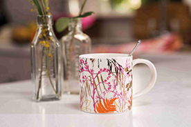
A There is so much going on for 2017. We’ve just launched an exciting collection of kitchen textiles and mugs. It is so luxurious and features a striking metallic print running through the range. We have another collaboration with Harlequin launching in July – last year’s Callista collection was so popular, we think this will be another success. Two new bed linen collections were also launched in February, so we have lots of exciting things to watch out for.
essence info
Websites: www.amara.com and www.clarissahulse.com
This article first appeared in The Lux Pad, www.amara.com/luxpad
Path to success
08/03/17 10:05 Filed in: Gardening

A path in a garden is often an expression of how an owner wishes to use it: an expression of personality in the landscape. Emanuela Alladio of Alladio Sims Garden Landscape Design Limited asks: “Which one are you?”.
A path can be a straight line, following the most direct route to reach a destination that might be a seat, a sculptural element or a view; it can be a meandering route, allowing time to linger to take in surroundings, or an unpredictable route that leads out and then allows the walker to find his or her own way on to lawns, into woods or round ponds. Alternatively, a path can follow a zig zag route that opens on to unpredicted elements or reveals the next surprise, be it a view or another unexpected space.
Gardens are all shapes and sizes and path options are as diverse, but they are key to a great design that delivers the user into a garden in a way that individually suits.
A couple of years ago, Alladio Sims created a show garden for the RHS Hampton Court Palace Flower Show. It was called ‘The Secret Garden Party’ and set out to illustrate a community of gardeners.
It became a study, investigating just how differently the paths crossing six equal sized and shaped front gardens could express a personality. The result was an eclectic mix of styles, atmospheres and solutions that was greatly admired by the public. While the spaces were small, the results were scalable and clearly showed how a path gives structure to the personality of a garden.
Our first garden welcomed a happy mix of softer and more formal elements – the rectangular stepping stones in a matte honed natural stone, chosen in two different sizes and spaced at regular intervals through the gravel connected the front door to the gate, while the surrounding gravel, in a complementing tone, let the path merge with the dry borders, softening and blurring the edges. Here the chosen line was straight, so quite formal, but with staggered ends showing the benefit of stepping stones that allow the movement to be more dynamic thanks to a mixture of stone sizes and offset joints.
Stepping stone paths would work equally well across a lawn loosely or directly linking to spaces beyond. They are relatively easy to construct and look very naturalised once they are allowed to settle in.
A wandering route is a great solution for those who prefer a more romantic or relaxed garden, and the materials chosen in our second garden show just how free its form can be: from a simple path mown out of long grass or a meadow, to a loose, windy gravel route through a dry garden, or a chipped bark path disappearing into a wood, naturalising to perfection as it ages. Wandering along such a path one is often surprised by sudden clearings, or peaceful sunny corners perfect for a bistro table and chair set: a haven for contemplation and relaxation.
In line with this relaxed approach and perfect for a sunny courtyard, the next garden used bricks laid across a diagonal straight line, cutting through the space and blurring boundaries with surrounding gravel mulch borders. Laying bricks across the route makes the space appear bigger and slows one down, an invitation to take time and linger. This is quite an informal path that brings to mind the Mediterranean, and with it images of gardens in Italy or Greece where plants and hard materials mingle to soften te boundaries and delight the eye.
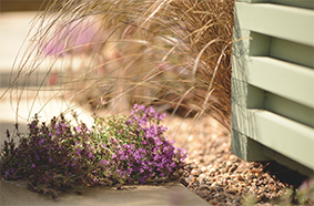
The feel of our third garden was mainly determined by the way the path was laid. Using standard stone slab sizes to create a staggered path gives a clear route, but with a more naturalised edge. This is a good alternative to a traditional red brick path. The soft pastel shades of the planting and picket fence complement the natural hues of the chosen paving stones in this contemporary English cottage garden. Spilling on top of the path, the dreamy planting softens the staggered edges and draws one in to smell the blooms.
Recycling can throw up some great solutions and in the next garden we reused clay roof tiles on edge. Rustic upcycled materials with gaps left for the plants to colonise created a strong textural element that fits in perfectly with the exuberant nature of the surrounding planting in this garden. There are other options for recycled materials including bricks, broken slabs and even wine bottles, used bases up, could work. They do lend themselves to a loose, winding path given the mismatched nature of the materials. This style would make the perfect choice in a classic country garden.
Overall, the paths in our first four gardens offered a certain degree of flexibility in the implementation of their designs and are probably the kind of creations that would appeal to a more informal ‘artisan’ type garden. The last two gardens, however, were aimed at showing paths that took control – with crisp edges that create strong transitions between soft and hard landscape. Garden five presented a curved path which showed just how the route may be soft in line, but unlike other wandering pathways, nothing here was left to chance: the slabs were perfectly cut, laid and grouted, and the finish is the same as would be expected on a kitchen floor. When selecting a curved path, material choice is key as most hard path materials are rectangular. Here we selected large slabs so that the edge kept the cut pieces larger and the angled direction broadened the sense of width.
The last garden really illustrates a path that takes total control of the space around it. This straight and perfectly symmetrical path provides a very precise solution to a classic design. The planting falls in line to reflect the very high degree of precision and extends the mirroring effect to the left and right of it. Requiring a solid base and very neat edges, the paving slabs are consistent in size and tones complementary to the formal planting. In larger gardens straight paths are used to lead the eye to a special view or feature at the end, and are perfect for creating long views in line with windows or doors.
In short, each path tells an interesting story – be it a reflection of a more artistic, free spirited or exuberant soul, or that of a style conscious minimalist spirit – and finding it is just one of the many surprises it will bring.
Next time you wander down a garden path, the backbone of any garden design, notice its very own unique story, or perhaps even just think, if I was a path, which path would I be?

Profile: Alladio Sims
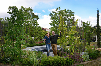
Alladio Sims Garden Landscape Design Ltd was established in 2015 after Jon Sims and Emanuela Alladio collaborated on a Silver Gilt winning show garden at RHS Hampton Court Palace Flower Show. The two directors continue their collaborative approach throughout their practice with Jon’s background in interior architecture giving distinctive spaces and Emanuela’s passion for plants and photographic eye adding great texture and contrast.
essence info
Alladio Sims Garden Landscape Design Limited
Unit C Willow House, Dragonfly Place, London SE4 2FJ
Website: www.alladiosims.co.uk
Email: hello@alladiosims.co.uk