textures
Opposites attract
12/04/17 12:44 Filed in: Gardening

Emanuela Alladio of Alladio Sims Garden Landscape Design Limited considers the art of combining contrasting textures in our outside spaces.
There are a million different shades of green in a garden. And when it comes to plants, many of them share at least one similarity – be it colour, form, shape or size. Yet in a successful garden each contrasting element – whether it’s a plant or hardscape – is able to contribute towards creating a sense of space, a certain mood and an excitement that sets the garden apart from any other space and draws eyes in. Exciting gardens know how to play with opposites, and how to successfully combine contrasting textures.
The key to the art of combining opposites relies on providing enough variation to create intensity without letting chaos settle in. A series of successful contrasting combinations in a garden introduces a layer of visual textures that lets our eyes ‘see’ each and every one of its elements.
The most obvious tools for creating texture in gardens are their building blocks – hardscape, plants and colour – constantly combined and rearranged until ultimate finesse is achieved.
Just like a chef would create a dish choosing each and every ingredient in the right quantity and introducing interesting flavour combinations by contrasting clashing ingredients, a garden designer sets out to create a garden by striving to achieve a very fine balance of all three of its main building blocks.
At the bottom of the pyramid is, of course, the hardscape – paths, patios, planters – key structural elements forming the backbone of visual texture, each material carefully chosen for its finish, that might contrast or absorb the texture from surrounding plants. A sleek, large, porcelain slab patio surrounded by soft linear and light reflecting grasses is a good example of contrasting textures and forms.
A step up is colour, to be found not only in flowers, but in bark, fruit and seeds, and in leaves too of course, to create a balanced backdrop of harmonious shades with peaks of interest in the form of contrasting colour combinations. Good examples of contrasting arrangements could be a blue geranium with a hot pink rose, or the lime green flower of alchemilla mollis against a purple heuchera or a black mondo grass.
And, of course, the key building blocks to create good visual texture are plants, through both their form and their leaf texture. Just think of how many habitats a plant can have and how important that is to the overall story a garden tells – a spiky plant is contemporary and sleek, it’s a full stop, because it commands attention making the viewer stop and look at it. Phormiums, with their upright and spiky form, are an emblem of confidence and showiness, while a trailing or spreading plant is much more informal, perfect to create an intimate atmosphere – think of a trailing nasturtium against a brick wall, or a billowing geranium spilling out of a border. Mastering clever contrasts between two opposite forms can produce stunning results: an upright allium or a spiky eryngium emerging through the soft fronds of a tall grass, one rigid and sharp the other softly arching in the wind.
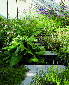
Foliage textures are all important too. In general, leaf types can be divided into four main categories and they too look stunning when contrasted between each other: Simple leaves – these could be oval, round or heart shaped etc – are provided by common plants such as bergenias, brunneras, foxgloves, tiny thyme or box. They form the base of any planting composition and can look stunning when contrasted between each other – not only in terms of proportions, but of hue too.
Linear or strappy leaves – these can be very upright as the rigid swords of astelias and phormiums, or more gently arching and soft, such as the blades of most grasses. Again, a sharp contrast between a phormium and a stipa tenuissima draws us in, forcing us to stop and feel the texture, running fingers through the grass.
Feathery and dissected leaves (ferns typify this group) introduce a layer of complexity. They are stunning against simpler leaf shapes, for example, a hosta and a fern next to each other, nothing is more beautiful yet so simple and so contrasting, or a fennel against a foxglove, bold form next to delicate and fine fronds.
And finally the true visual delight of exuberant leaf shapes – be it very dissected, such as those of geraniums or very frilly and deeply lobed such as Japanese maples – they are perfect to accent a scheme with the right amount of frilliness and bling. Imagine a red Japanese maple underplanted with the strappy acid green leaves of hakonechloa and next to a round leaved vivid green or purple cotinus. These are true opposites in terms of textures and shapes, and yet so elegant and refined together, adding a real punch and making a unique statement.

Profile: Alladio Sims
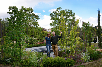
Alladio Sims Garden Landscape Design Ltd was established in 2015 after Jon Sims and Emanuela Alladio collaborated on a Silver Gilt winning show garden at RHS Hampton Court Palace Flower Show. The two directors continue their collaborative approach throughout their practice with Jon’s background in interior architecture giving distinctive spaces and Emanuela’s passion for plants and photographic eye adding great texture and contrast.
essence info
Alladio Sims Garden Landscape Design Limited
Unit C Willow House, Dragonfly Place, London SE4 2FJ
Website: www.alladiosims.co.uk
Email: hello@alladiosims.co.uk